Week3 Lab Tutorial Timeline
Time |
Activity |
|---|---|
16:00–16:05 |
Introduction — Overview of the main tasks for the lab tutorials |
16:05–16:45 |
Tutorial: Static maps — Follow Section 3.1 of the Jupyter Notebook to practice the static maps |
16:45–17:30 |
Tutorial: Interactive maps — Follow Section 3.2 of the Jupyter Notebook to practice the interactive maps using folium |
17:30–17:55 |
Quiz — Complete quiz tasks |
17:55–18:00 |
Wrap-up — Recap key points and address final questions |
For this module’s lab tutorials, you can download all the required data using the provided link (click).
Please make sure that both the Jupyter Notebook file and the data and img folder are placed in the same directory (specifically within the STBDA_lab folder) to ensure the code runs correctly.
Week 3 Key Takeaways:
Create static maps and their elements (narrow arrow, scale bar, and legend) using Geopandas, Matplotlib, and Seaborn.
Create interactive maps using Folium and customize the maps using different functions and plugins in Folium.
Customize static and interactive maps for different geospatial types.
3 Visualisation for big geospatial data#
Principles of map visualization (cartography):
Map design: The process of creating maps that effectively communicate spatial information.
Map types: Different types of maps, such as dot, proportional, and choropleth maps.
Map interactivity: The ability to interact with maps through zooming, panning, and clicking on features.
Map elements: The components of a map, including title, legend, scale, and north arrow.
Map projections: The methods used to represent the curved surface of the Earth on a flat map.
3.1 Static maps#
We have used the gdf.plot() function in Geopandas and Matplotlb in the previous weeks to visualize geospatial data. This function is a simple way to create static maps,so we will use this function to visualize the geospatial data, i.e., mapping.
# Import the required libraries
import pandas as pd
import numpy as np
import geopandas as gpd
import seaborn as sns
sns.set_theme(style="ticks")
import matplotlib.pyplot as plt
import warnings
warnings.filterwarnings("ignore")
3.1.1 Dot map#
A dot map can be used to visualize the distribution of the point data. The dot map can directly show the density of the locations for a large number of points.
We have visualized the distribution of the Transport for London (TfL) Underground/Tube stations in last week, we add the TfL Bus Stop Locations in this section.
# Read the TfL Bus Stop Locations data
df_bus_stop = pd.read_csv("data/tfl_bus-stops.csv")
# the location coordinates are in the columns named 'Location_Easting' and 'Location_Northing' which are in the British National Grid (OSGB36) coordinate system.
df_bus_stop.head()
| Stop_Code_LBSL | Bus_Stop_Code | Naptan_Atco | Stop_Name | Location_Easting | Location_Northing | Heading | Stop_Area | Virtual_Bus_Stop | |
|---|---|---|---|---|---|---|---|---|---|
| 0 | 1000 | 91532 | 490000266G | WESTMINSTER STATION <> / PARLIAMENT SQUARE | 530171.0 | 179738.0 | 177.0 | 0K08 | 0.0 |
| 1 | 10001 | 72689 | 490013793E | TREVOR CLOSE | 515781.0 | 174783.0 | 78.0 | NB16 | 0.0 |
| 2 | 10002 | 48461 | 490000108F | HIGHBURY CORNER | 531614.0 | 184603.0 | 5.0 | C902 | 0.0 |
| 3 | 10003 | 77150 | 490000108B | HIGHBURY & ISLINGTON STATION <> # | 531551.0 | 184803.0 | 127.0 | C903 | 0.0 |
| 4 | 10004 | 48037 | 490012451S | ST MARY MAGDALENE CHURCH | 531365.0 | 184986.0 | 141.0 | C904 | 0.0 |
# Convert the DataFrame to a GeoDataFrame
gdf_bus_stop = gpd.GeoDataFrame(df_bus_stop, geometry=gpd.points_from_xy(df_bus_stop['Location_Easting'], df_bus_stop['Location_Northing']))
# Set the coordinate reference system (CRS) to OSGB36
gdf_bus_stop.crs = "EPSG:27700"
# We also need the London boundary (we create this boundary by dissolve function in last week) to add the background of the map.
gdf_london_boundary = gpd.read_file("data/whole_london_boundary.geojson")
# transfer the coordinate system of the London boundary to OSGB36
gdf_london_boundary = gdf_london_boundary.to_crs("EPSG:27700")
Note that we don’t need the matplotlib if we only use the gdf.plot() to visualise one layer of geospatial data. But we need the matplotlib to plot multiple layers of geospatial data on the same map. As there is no inherent function for use to draw the scale bar and north arrow in Geopandas, so we need to use the other library to add the scale bar and north arrow on the map (You can find the instruction of scale bar and north arrow in this page(click)).
# Plot the bus stops and London boundary on a map
# Create a figure and axis
# NOTE: you MUST set the desired DPI here, when the subplots are created
# so that the scale_bar's DPI matches!
fig, ax = plt.subplots(figsize=(6, 6), dpi=300)
# Plot the London boundary
gdf_london_boundary.plot(ax=ax, # ax is the axis to plot on
                          color='lightgrey', # color of the polygon
                          edgecolor='black', # color of the boundary
                          alpha=0.3, # transparency of all colors
                          linewidth=0.5) # linewidth of the polygon boundary
# The bus stop points plot
gdf_bus_stop.plot(ax=ax, # another layer of points but put in the same axis
                  color='RoyalBlue', # color of the points
                  edgecolor='grey',  # color of the point boundary
                  linewidth=0.05, # linewidth of the point boundary
                  markersize=2, # size of the points
                  alpha=0.4, # transparency of the all colors
                  label='TfL Bus Stops', # label of the points
                   )
# We need the matplotlib_map_utils to add the scale bar and north arrow on the map
from matplotlib_map_utils.core.north_arrow import NorthArrow, north_arrow
from matplotlib_map_utils.core.scale_bar import ScaleBar, scale_bar
NorthArrow.set_size("small")
ScaleBar.set_size("small")
# Add the North Arrow and scale bar to the map
north_arrow(ax, location="upper right", rotation={"crs": 'EPSG:27700', "reference": 'center'})
scale_bar(ax, location="upper left", style="boxes", bar={"projection": 'EPSG:27700'})
# Set the title
ax.set_title('TfL Bus Stops in London')
# Set the legend
ax.legend(labels=['Bus Stops Locations'], loc='lower left', fontsize=8)
ax.set_xlabel('Easting (m)')
ax.set_ylabel('Northing (m)')
# We can save the figure as a jpg file
plt.savefig("fig/tfl_bus_stops.jpg", dpi=300, bbox_inches='tight')
plt.show()
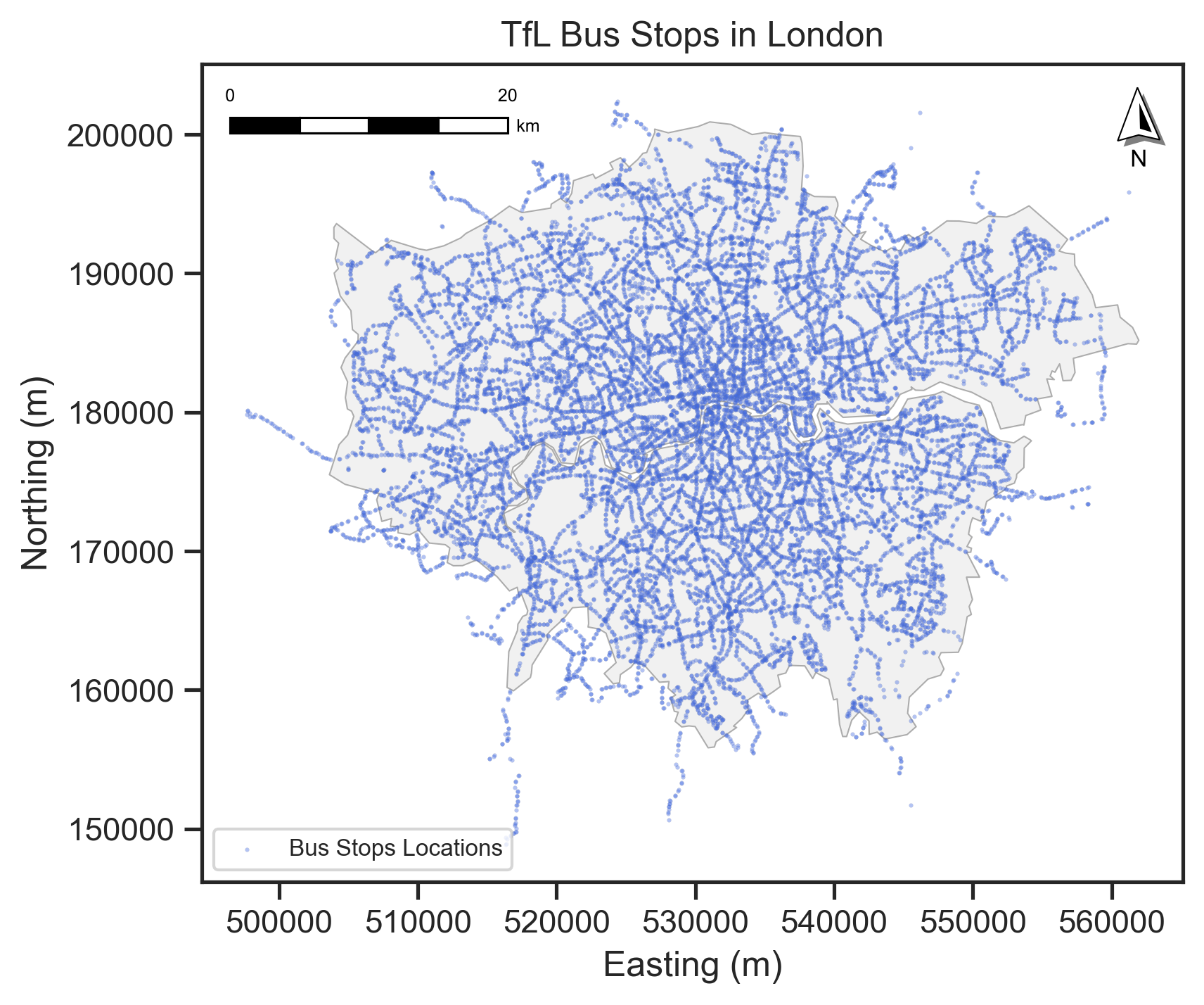
From the map of TfL Bus Stops, we can see that the bus stops are more concentrated in the central London area, and the density of bus stops is lower in the outer London area.
Tailoring the dot map
We can tailor the dot map by changing the size of the dots, the color of the dots, and the transparency of the dots according to different attributes of the data (e.g., categorical data and numerical data).
Different colors represent different categories of the data (e.g., different types of transport).
Different sizes represent different values of the data (e.g., population size).
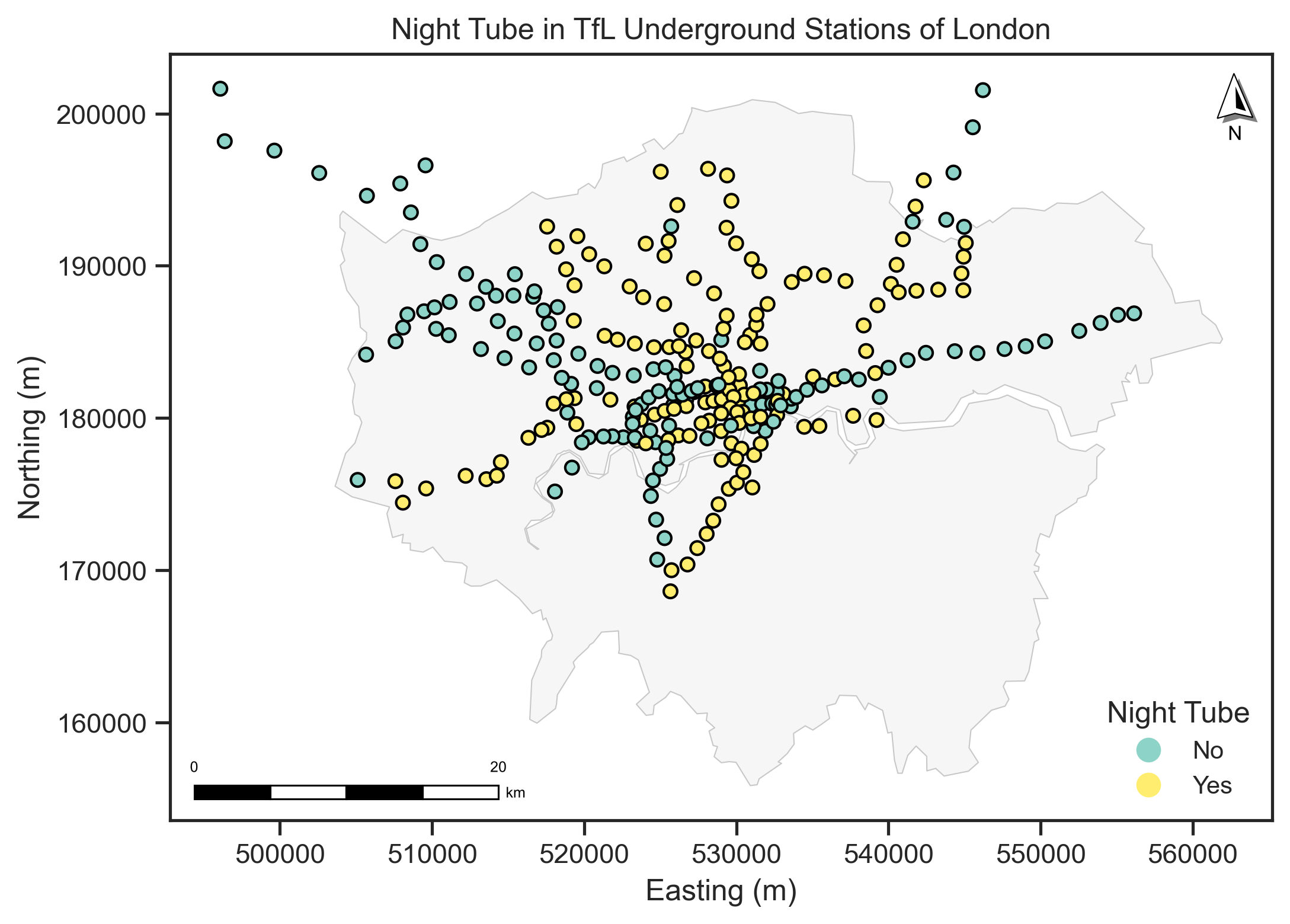
We will use the ‘NIGHT_TUBE’ column to tailor the dot map. The ‘NIGHT_TUBE’ column indicates whether the station is served by the Night Tube service or not. The Night Tube service is a 24-hour service on some London Underground lines, which allows passengers to travel at any time of the day or night. For selecting the colormap (cmap), you can refer to the Colormap from Matplotlib.
# Read the TfL Underground station geo-data
gdf_underground = gpd.read_file("data/Underground_Stations.geojson")
# transfer the coordinate system of the Underground stations to OSGB36
gdf_underground = gdf_underground.to_crs("EPSG:27700")
gdf_underground
| OBJECTID | NAME | LINES | ATCOCODE | MODES | ACCESSIBILITY | NIGHT_TUBE | NETWORK | DATASET_LAST_UPDATED | FULL_NAME | geometry | |
|---|---|---|---|---|---|---|---|---|---|---|---|
| 0 | 111 | St. Paul's | Central | 940GZZLUSPU | bus, tube | Not Accessible | Yes | London Underground | 2021-11-29 00:00:00+00:00 | St. Paul's station | POINT Z (532108.364 181274.192 0) |
| 1 | 112 | Mile End | District, Hammersmith & City, Central | 940GZZLUMED | bus, tube | Partially Accessible - Interchange Only | Yes | London Underground | 2021-11-29 00:00:00+00:00 | Mile End station | POINT Z (536500.796 182534.495 0) |
| 2 | 113 | Bethnal Green | Central | 940GZZLUBLG | bus, tube | Not Accessible | Yes | London Underground | 2021-11-29 00:00:00+00:00 | Bethnal Green station | POINT Z (535043.555 182718.413 0) |
| 3 | 114 | Leyton | Central | 940GZZLULYN | bus, tube | Not Accessible | Yes | London Underground | 2021-11-29 00:00:00+00:00 | Leyton station | POINT Z (538367.45 186075.857 0) |
| 4 | 115 | Snaresbrook | Central | 940GZZLUSNB | bus, tube | Not Accessible | Yes | London Underground | 2021-11-29 00:00:00+00:00 | Snaresbrook station | POINT Z (540156.785 188804.046 0) |
| ... | ... | ... | ... | ... | ... | ... | ... | ... | ... | ... | ... |
| 268 | 483 | Seven Sisters | Victoria | 940GZZLUSVS | tube | Not Accessible | Yes | London Underground | 2021-11-29 00:00:00+00:00 | Seven Sisters station | POINT Z (533642.911 188930.916 0) |
| 269 | 484 | Theydon Bois | Central | 940GZZLUTHB | tube | Partially Accessible | No | London Underground | 2021-11-29 00:00:00+00:00 | Theydon Bois station | POINT Z (545541.525 199100.831 0) |
| 270 | 485 | Kenton | Bakerloo | 940GZZLUKEN | tube | Not Accessible | No | London Underground | 2021-11-29 00:00:00+00:00 | Kenton station | POINT Z (516728.004 188314.476 0) |
| 271 | 486 | Woodside Park | Northern | 940GZZLUWOP | tube, bus | Fully Accessible | No | London Underground | 2021-11-29 00:00:00+00:00 | Woodside Park station | POINT Z (525718.458 192588.13 0) |
| 272 | 487 | Preston Road | Metropolitan | 940GZZLUPRD | tube, bus | Not Accessible | No | London Underground | 2021-11-29 00:00:00+00:00 | Preston Road station | POINT Z (518249.344 187281.833 0) |
273 rows × 11 columns
# Create a figure and axis
fig, ax = plt.subplots(figsize=(8, 8), dpi=300)
# Plot the London boundary
gdf_london_boundary.plot(ax=ax, # ax is the axis to plot on
                          color='lightgrey', # color of the polygon
                          edgecolor='black', # color of the boundary
                          alpha=0.2, # transparency of all colors
                          linewidth=0.5) # linewidth of the polygon boundary
# The Underground stations plot
gdf_underground.plot(ax=ax,
                     column='NIGHT_TUBE', # column name to tailor the dot map, here is the categorical data
                     cmap='Set3', # color map
                      # note that we can use inherent legent=True to show the legend
                      # as we use the column name, we did not use it in the last map.
                      legend=True, # show the legend
                      legend_kwds={'loc': 'lower right', # legend position
                        'title': 'Night Tube', # legend title
                        'fontsize': 10, # legend title font size
                        'title_fontsize': 12, # legend title font size
                        'frameon': False, # legend frame
                                    }, # legend position
                      markersize=30, # size of the points
                      edgecolor='black', # color of the point boundary
                      alpha=1) # transparency of the all colors
# Add the North Arrow and scale bar to the map
north_arrow(ax, location="upper right", rotation={"crs": gdf_underground.crs, "reference": "center"})
scale_bar(ax, location="lower left", style="boxes", bar={"projection": gdf_underground.crs})
# Set the title
ax.set_title('Night Tube in TfL Underground Stations of London')
ax.set_xlabel('Easting (m)')
ax.set_ylabel('Northing (m)')
plt.savefig("fig/tfl_night_tube.jpg", dpi=300, bbox_inches='tight')
plt.show
<function matplotlib.pyplot.show(close=None, block=None)>
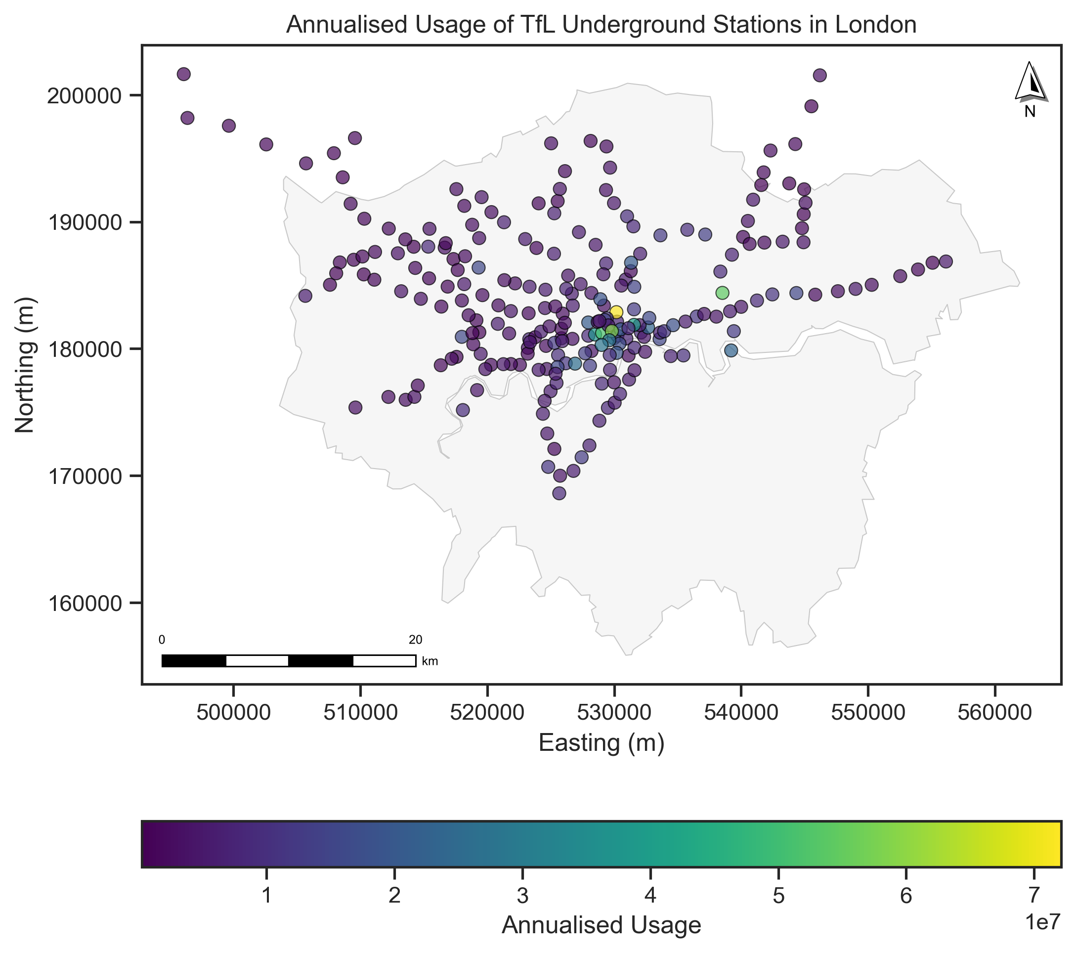
We will add usage information (counted by entry/exit) of London Underground stations to build a dot map. The usage data was published by TfL in the London Underground Station Crowding page. The usage data is in the CSV or XLSX format, and we can read it using the Pandas library.
# Read the 2023 London Underground station usage data
df_usage = pd.read_excel("data/TfL_AC2023_AnnualisedEntryExit.xlsx", header=5)
df_usage.head()
| Unnamed: 0 | Unnamed: 1 | Unnamed: 2 | Unnamed: 3 | Unnamed: 4 | Unnamed: 5 | Monday | Midweek (Tue-Thu) | Friday | Saturday | Sunday | Monday.1 | Midweek (Tue-Thu).1 | Friday.1 | Saturday.1 | Sunday.1 | Weekly | 12-week | Annualised | |
|---|---|---|---|---|---|---|---|---|---|---|---|---|---|---|---|---|---|---|---|
| 0 | Mode | MNLC | MASC | Station | Coverage | Source | Entries | Entries | Entries | Entries | Entries | Exits | Exits | Exits | Exits | Exits | En/Ex | En/Ex | En/Ex |
| 1 | LU | 500 | ACTu | Acton Town | Station entry/exit | Gateline | 7288 | 8125 | 8016 | 6552 | 4684 | 7546 | 8438 | 8245 | 6696 | 5224 | 103940 | 1188670 | 4823835 |
| 2 | LU | 502 | ALDu | Aldgate | Station entry/exit | Gateline | 10183 | 12769 | 9612 | 6518 | 4860 | 11247 | 14494 | 11040 | 7982 | 5387 | 148617 | 1699609 | 6897314 |
| 3 | LU | 503 | ALEu | Aldgate East | Station entry/exit | Gateline | 16046 | 19106 | 18158 | 17203 | 12549 | 15225 | 17758 | 17903 | 17163 | 11058 | 235895 | 2697738 | 10947896 |
| 4 | LU | 505 | ALPu | Alperton | Station entry/exit | Gateline | 4187 | 4234 | 4294 | 3532 | 2487 | 4497 | 4539 | 4413 | 3682 | 2580 | 55992 | 640338 | 2598605 |
# we only need the London Underground stations and annualised usage, so we need to filter the data.
df_usage_lu = df_usage[df_usage['Unnamed: 0'] == 'LU'][['Unnamed: 3', 'Annualised']].rename(columns={'Unnamed: 3': 'name', 'Annualised': 'usage'})
df_usage_lu.head()
| name | usage | |
|---|---|---|
| 1 | Acton Town | 4823835 |
| 2 | Aldgate | 6897314 |
| 3 | Aldgate East | 10947896 |
| 4 | Alperton | 2598605 |
| 5 | Amersham | 1729521 |
# Then we combine the usage data with the TfL Underground stations data by the station name.
gdf_underground_usage = pd.merge(gdf_underground, df_usage_lu, left_on='NAME', right_on='name', how='left')
gdf_underground_usage
| OBJECTID | NAME | LINES | ATCOCODE | MODES | ACCESSIBILITY | NIGHT_TUBE | NETWORK | DATASET_LAST_UPDATED | FULL_NAME | geometry | name | usage | |
|---|---|---|---|---|---|---|---|---|---|---|---|---|---|
| 0 | 111 | St. Paul's | Central | 940GZZLUSPU | bus, tube | Not Accessible | Yes | London Underground | 2021-11-29 00:00:00+00:00 | St. Paul's station | POINT Z (532108.364 181274.192 0) | St. Paul's | 9189088 |
| 1 | 112 | Mile End | District, Hammersmith & City, Central | 940GZZLUMED | bus, tube | Partially Accessible - Interchange Only | Yes | London Underground | 2021-11-29 00:00:00+00:00 | Mile End station | POINT Z (536500.796 182534.495 0) | Mile End | 11145822 |
| 2 | 113 | Bethnal Green | Central | 940GZZLUBLG | bus, tube | Not Accessible | Yes | London Underground | 2021-11-29 00:00:00+00:00 | Bethnal Green station | POINT Z (535043.555 182718.413 0) | NaN | NaN |
| 3 | 114 | Leyton | Central | 940GZZLULYN | bus, tube | Not Accessible | Yes | London Underground | 2021-11-29 00:00:00+00:00 | Leyton station | POINT Z (538367.45 186075.857 0) | Leyton | 8592536 |
| 4 | 115 | Snaresbrook | Central | 940GZZLUSNB | bus, tube | Not Accessible | Yes | London Underground | 2021-11-29 00:00:00+00:00 | Snaresbrook station | POINT Z (540156.785 188804.046 0) | Snaresbrook | 1849887 |
| ... | ... | ... | ... | ... | ... | ... | ... | ... | ... | ... | ... | ... | ... |
| 268 | 483 | Seven Sisters | Victoria | 940GZZLUSVS | tube | Not Accessible | Yes | London Underground | 2021-11-29 00:00:00+00:00 | Seven Sisters station | POINT Z (533642.911 188930.916 0) | Seven Sisters | 12165434 |
| 269 | 484 | Theydon Bois | Central | 940GZZLUTHB | tube | Partially Accessible | No | London Underground | 2021-11-29 00:00:00+00:00 | Theydon Bois station | POINT Z (545541.525 199100.831 0) | Theydon Bois | 734300 |
| 270 | 485 | Kenton | Bakerloo | 940GZZLUKEN | tube | Not Accessible | No | London Underground | 2021-11-29 00:00:00+00:00 | Kenton station | POINT Z (516728.004 188314.476 0) | Kenton | 1515511 |
| 271 | 486 | Woodside Park | Northern | 940GZZLUWOP | tube, bus | Fully Accessible | No | London Underground | 2021-11-29 00:00:00+00:00 | Woodside Park station | POINT Z (525718.458 192588.13 0) | Woodside Park | 3657219 |
| 272 | 487 | Preston Road | Metropolitan | 940GZZLUPRD | tube, bus | Not Accessible | No | London Underground | 2021-11-29 00:00:00+00:00 | Preston Road station | POINT Z (518249.344 187281.833 0) | Preston Road | 2423452 |
273 rows × 13 columns
# Note that the usage columns have some missing values and some values are string '---' which means no data.
# You can use more codes to fill the data as NaN occurs as the mismatch of the name between the two datasets, though some cases are indicating one station.
print(gdf_underground_usage.usage.values)
[9189088 11145822 nan 8592536 1849887 6955728 1948236 4051381 3371643
 1167037 885823 4492296 267679 332284 nan 4383503 8491273 10787392 806675
 1503305 3937018 1212120 2153159 1860607 6314434 3063800 1597432 6030683
 6258859 1631696 1555062 1663555 1654538 2598605 4159381 13568222 27379635
 12573815 7822836 5106522 2203557 3293586 3947509 1450247 2307306 5962575
 7049636 nan 4377539 nan 14965619 6897314 nan 23330204 5185508 40070382
 72124262 11239346 21207073 nan nan 3644937 9413060 11353518 26088906
 2074444 1841679 5785361 3763523 5568858 7890670 nan 2624208 2899358 nan
 nan 7087668 nan 14076462 2645552 2542830 1623305 838918 3216718 1804676
 1952034 5748997 2138577 15779710 4373423 12110869 3172252 8590075
 37424555 1722368 3269238 5652447 5008989 nan 51106043 20240977 7803444
 9576731 6802053 nan 23172392 12328817 5573360 nan 5236551 7045026 5339416
 7137484 12397420 6265211 6323510 8040059 5210928 5113576 58726155 3889479
 2967011 4532637 '---' 4875982 5615724 4633070 3130908 1604937 1455300
 4909025 14142708 8975412 nan 6151983 1786001 2752421 2861021 397280
 1841035 3276268 2005688 3043893 3466311 3061427 820575 3540050 2385943
 17051267 2042489 1817060 2466317 4598994 1296040 nan 3937317 4045767
 26739879 nan nan 2689160 nan 2681574 2617813 nan 2297814 13156281 2717311
 nan 5022937 9088053 4266560 19172572 '---' nan nan 4774045 5338957
 13349683 15429088 4823835 1954910 28247401 20479785 7381051 8263631 nan
 2852360 2776023 3000487 3370726 1675267 2782422 5240900 6823150 5181211
 2134593 4663306 10947896 17452196 4157626 15510977 2565708 1989399 nan
 1057631 54376225 5419509 1373730 853803 1463521 1396078 1408690 1003523
 3340365 1398638 2223811 8435460 3353641 3002979 2073359 5870213 8508705
 nan 11223888 1296777 8399835 4108613 4040066 605628 4354076 nan 5347065
 4731235 4827763 nan 3529781 2547324 4780369 3727656 8875310 3019402
 9534074 7948900 15137045 3609039 1435853 5133701 3259745 2158123 1729521
 5426495 nan 18805872 nan 4321012 5198096 4408040 966889 1851241 808774
 2162088 837496 1653584 4067823 15846905 12258814 5179915 12165434 734300
 1515511 3657219 2423452]
# We need to convert the usage column to numeric and replace the '---' with NaN.
gdf_underground_usage['usage'] = gdf_underground_usage['usage'].replace('---', np.nan)
# Drop non-values
gdf_underground_usage_s = gdf_underground_usage[~gdf_underground_usage['usage'].isna()]
gdf_underground_usage_s
| OBJECTID | NAME | LINES | ATCOCODE | MODES | ACCESSIBILITY | NIGHT_TUBE | NETWORK | DATASET_LAST_UPDATED | FULL_NAME | geometry | name | usage | |
|---|---|---|---|---|---|---|---|---|---|---|---|---|---|
| 0 | 111 | St. Paul's | Central | 940GZZLUSPU | bus, tube | Not Accessible | Yes | London Underground | 2021-11-29 00:00:00+00:00 | St. Paul's station | POINT Z (532108.364 181274.192 0) | St. Paul's | 9189088.0 |
| 1 | 112 | Mile End | District, Hammersmith & City, Central | 940GZZLUMED | bus, tube | Partially Accessible - Interchange Only | Yes | London Underground | 2021-11-29 00:00:00+00:00 | Mile End station | POINT Z (536500.796 182534.495 0) | Mile End | 11145822.0 |
| 3 | 114 | Leyton | Central | 940GZZLULYN | bus, tube | Not Accessible | Yes | London Underground | 2021-11-29 00:00:00+00:00 | Leyton station | POINT Z (538367.45 186075.857 0) | Leyton | 8592536.0 |
| 4 | 115 | Snaresbrook | Central | 940GZZLUSNB | bus, tube | Not Accessible | Yes | London Underground | 2021-11-29 00:00:00+00:00 | Snaresbrook station | POINT Z (540156.785 188804.046 0) | Snaresbrook | 1849887.0 |
| 5 | 116 | Leytonstone | Central | 940GZZLULYS | bus, tube | Not Accessible | Yes | London Underground | 2021-11-29 00:00:00+00:00 | Leytonstone station | POINT Z (539279.289 187404.74 0) | Leytonstone | 6955728.0 |
| ... | ... | ... | ... | ... | ... | ... | ... | ... | ... | ... | ... | ... | ... |
| 268 | 483 | Seven Sisters | Victoria | 940GZZLUSVS | tube | Not Accessible | Yes | London Underground | 2021-11-29 00:00:00+00:00 | Seven Sisters station | POINT Z (533642.911 188930.916 0) | Seven Sisters | 12165434.0 |
| 269 | 484 | Theydon Bois | Central | 940GZZLUTHB | tube | Partially Accessible | No | London Underground | 2021-11-29 00:00:00+00:00 | Theydon Bois station | POINT Z (545541.525 199100.831 0) | Theydon Bois | 734300.0 |
| 270 | 485 | Kenton | Bakerloo | 940GZZLUKEN | tube | Not Accessible | No | London Underground | 2021-11-29 00:00:00+00:00 | Kenton station | POINT Z (516728.004 188314.476 0) | Kenton | 1515511.0 |
| 271 | 486 | Woodside Park | Northern | 940GZZLUWOP | tube, bus | Fully Accessible | No | London Underground | 2021-11-29 00:00:00+00:00 | Woodside Park station | POINT Z (525718.458 192588.13 0) | Woodside Park | 3657219.0 |
| 272 | 487 | Preston Road | Metropolitan | 940GZZLUPRD | tube, bus | Not Accessible | No | London Underground | 2021-11-29 00:00:00+00:00 | Preston Road station | POINT Z (518249.344 187281.833 0) | Preston Road | 2423452.0 |
241 rows × 13 columns
# Plot the Underground stations with usage data
# Create a figure and axis
fig, ax = plt.subplots(figsize=(8, 8), dpi=300)
# Plot the London boundary
gdf_london_boundary.plot(ax=ax, # ax is the axis to plot on
                          color='lightgrey', # color of the polygon
                          edgecolor='black', # color of the boundary
                          alpha=0.2, # transparency of all colors
                          linewidth=0.5) # linewidth of the polygon boundary
# The Underground stations plot
gdf_underground_usage_s.plot(ax=ax,
                        column='usage', # column name to tailor the dot map, here is the numerical data
                        cmap='viridis', # color map
                        markersize=40, # size of the points
                        alpha=0.7, # transparency of the all colors
                        edgecolor='black', # color of the point boundary
                        linewidth=0.5, # linewidth of the point boundary
                        legend=True,
                        legend_kwds={ "label": "Annualised Usage",
                                    "orientation": "horizontal"
                                    })
# Add the North Arrow and scale bar to the map
north_arrow(ax, location="upper right", rotation={"crs": gdf_underground.crs, "reference": "center"})
scale_bar(ax, location="lower left", style="boxes", bar={"projection": gdf_underground.crs})
# Set the title
ax.set_title('Annualised Usage of TfL Underground Stations in London')
ax.set_xlabel('Easting (m)')
ax.set_ylabel('Northing (m)')
plt.savefig("fig/tfl_usage.jpg", dpi=300, bbox_inches='tight')
plt.show()
3.1.2 Proportional map#
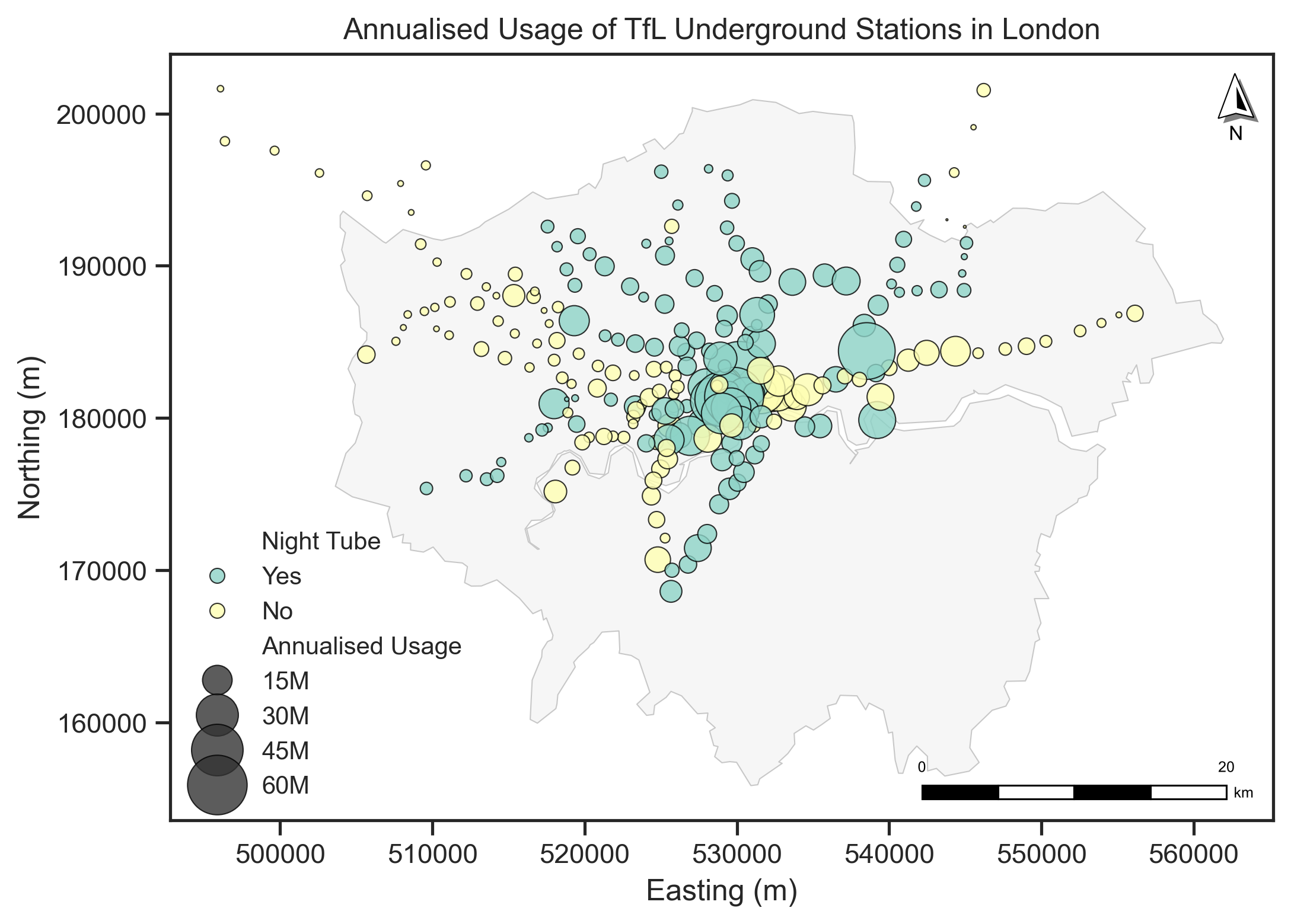
A proportional map is a variation of a dot map, where the size of the dots is proportional to the value of the variable being represented.
We can also use the size of the dot to represent the usage and use the colors to represent the different types of stations (like the night tube or not) of the Underground stations in this map. This means we bring three attributes of the data (locations, usage, type of night, or not) into one map.
Note that in Geopandas gdf.plot(), only the legend=True only works automatically when you’re coloring your data by a column using the column= or color=. It does not create a legend for markersize if you pass a markersize argument like markersize=gdf_underground_usage_s.usage/100000 in the gdf.plot(). So we need to create a legend manually, or we can use another library like matplotlib or seaborn to help us.
# Plot the Underground stations with usage data
# Create a figure and axis
fig, ax = plt.subplots(figsize=(8, 8),dpi=300)
# Plot the London boundary
gdf_london_boundary.plot(ax=ax, # ax is the axis to plot on
                          color='lightgrey', # color of the polygon
                          edgecolor='black', # color of the boundary
                          alpha=0.2, # transparency of all colors
                          linewidth=0.5) # linewidth of the polygon boundary
# We use the seaborn to plot the Underground stations
sns.scatterplot(ax=ax,
                data=gdf_underground_usage_s,
                x=gdf_underground_usage_s.geometry.x, # x coordinate
                y=gdf_underground_usage_s.geometry.y, # y coordinate
                hue='NIGHT_TUBE', # column name to tailor the dot map, here is the categorical data
                size=gdf_underground_usage_s['usage'], # size of the points
                sizes=(0, 700), # size range of the point selection
                alpha=0.8, # transparency of the all colors
                palette='Set3', # color map
                linewidth=0.5, # linewidth of the point boundary
                edgecolor='black', # color of the point boundary
                legend=True,
                 )
# Add the North Arrow and scale bar to the map
north_arrow(ax, location="upper right", rotation={"crs": gdf_london_boundary.crs, "reference": "center"})
scale_bar(ax, location="lower right", style="boxes", bar={"projection": gdf_london_boundary.crs})
# Set the legend
handles, labels = ax.get_legend_handles_labels()
ax.legend(handles=handles,
          labels=['Night Tube', 'Yes', 'No', 'Annualised Usage', '15M', '30M', '45M', '60M'],
          loc='lower left', fontsize=10, title_fontsize=12, frameon=False)
# Set the title
ax.set_title('Annualised Usage of TfL Underground Stations in London')
ax.set_xlabel('Easting (m)')
ax.set_ylabel('Northing (m)')
plt.savefig("fig/tfl_usage_2.jpg", dpi=300, bbox_inches='tight')
plt.show()
3.1.3 Choropleth map#
A choropleth map is a type of thematic map where areas are shaded or patterned in proportion to the value of a variable being represented. It is used to visualize the spatial distribution of a variable across different regions (Polygons).
We use the UK LAs data to create a choropleth map according to different thematic topics.
# Read the UK LAs data
gdf_las = gpd.read_file("data/Local_Authority_Districts_December_2024_Boundaries_UK_BSC.geojson")
# Convert the coordinate reference system (CRS) to OSGB
gdf_las = gdf_las.to_crs("EPSG:27700")
gdf_las['area'] = gdf_las.geometry.area / 1e6 # convert the area to km2
We add a 2022 estimated resident population data of LAs from ONS (Office for National Statistics) to the gdf_las dat and create a choropleth map of population density distribution in the UK LAs.
# Read the 2022 population data
df_pop = pd.read_csv("data/populaiton_2022_all_ages_uk.csv")
df_pop.head()
| Code | Name | Geography | All ages | |
|---|---|---|---|---|
| 0 | K02000001 | UNITED KINGDOM | Country | 67596281 |
| 1 | K03000001 | GREAT BRITAIN | Country | 65685738 |
| 2 | K04000001 | ENGLAND AND WALES | Country | 60238038 |
| 3 | E92000001 | ENGLAND | Country | 57106398 |
| 4 | E12000001 | NORTH EAST | Region | 2683040 |
# merge the population data with the gdf_las data
gdf_las_pop = pd.merge(gdf_las, df_pop, left_on='LAD24CD', right_on='Code', how='left')
gdf_las_pop = gdf_las_pop.rename(columns={'All ages': 'population'})
# calculate the population density
gdf_las_pop['density'] = gdf_las_pop['population'] / gdf_las_pop['area'] # calculate the population density
# Plot the choropleth map of population distribution
# Create a figure and axis
fig, ax = plt.subplots(figsize=(8, 10), dpi=150)
# Plot the UK LAs
gdf_las_pop.plot(ax=ax, # ax is the axis to plot on
                  column='density', # column name to tailor the choropleth map, here is the numerical data
                  cmap='RdPu', # color map
                  edgecolor='black', # color of the polygon boundary
                  linewidth=0.1, # linewidth of the polygon boundary
                  alpha=1, # transparency of the all colors
                  legend=True,
                  legend_kwds={ "label": "Population density (per $km^2$)", # legend title
                                "orientation": "vertical", # legend orientation
                                "shrink": 0.6, # legend size shrink
                                },
                  )
# Add the North Arrow and scale bar to the map
north_arrow(ax, location="upper right", rotation={"crs": gdf_las_pop.crs, "reference": "center"})
scale_bar(ax, location="lower right", style="boxes", bar={"projection": gdf_las_pop.crs})
# Set the title
ax.set_title('Population Density Distribution in UK LAs')
ax.set_xlabel('Easting (m)')
ax.set_ylabel('Northing (m)')
plt.savefig("fig/uk_la_pop_den.jpg", dpi=300, bbox_inches='tight')
plt.show()
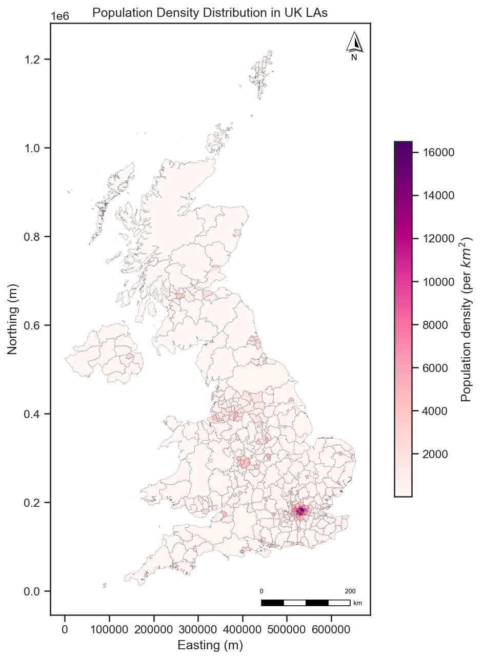
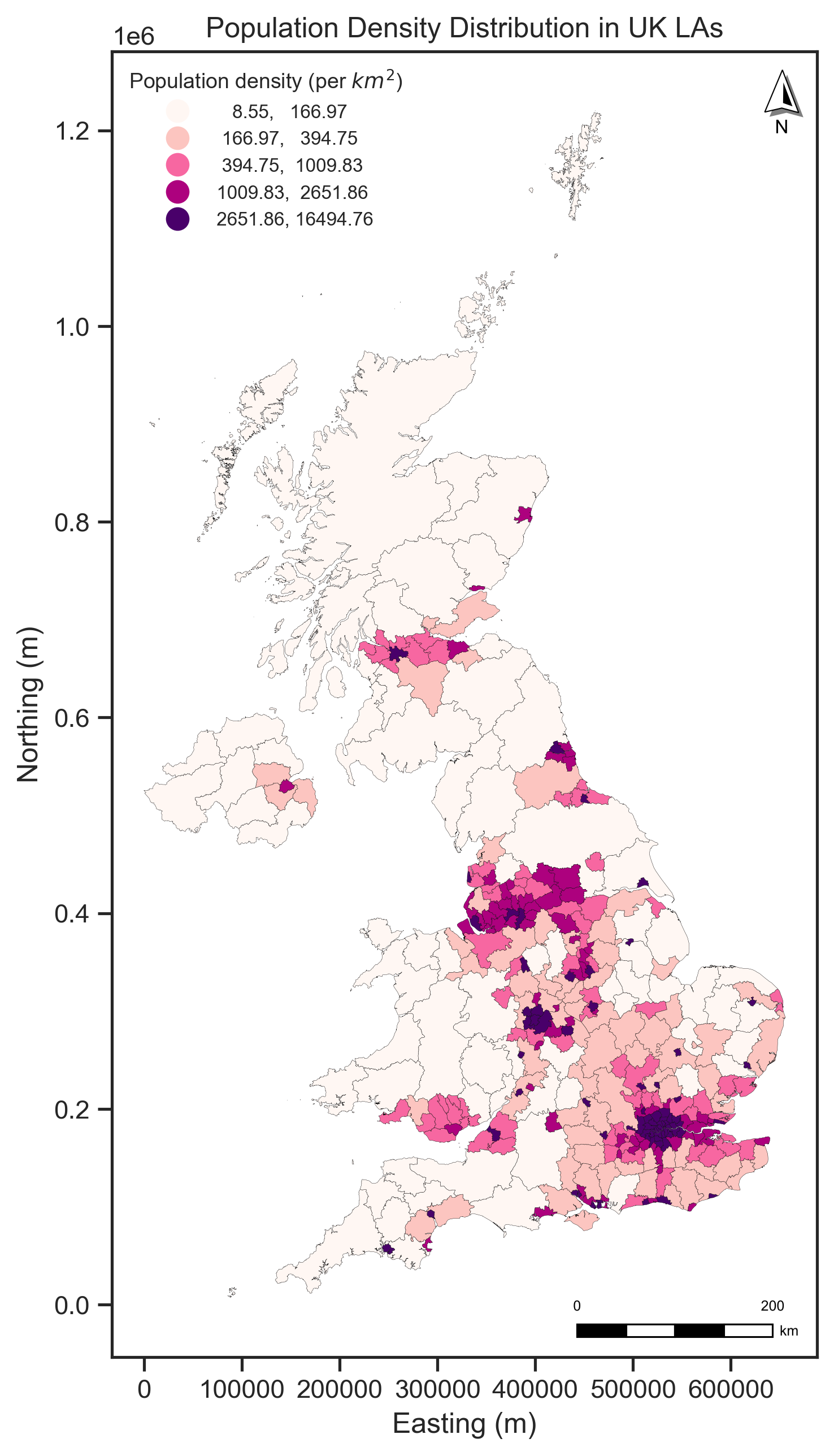
We have used a sequential color to plot the population distribution across the UK LAs. The darker the color, the higher the population. Alternatively, we can change the legend which means we can use the categorical data to plot the choropleth map. For example, we can classify the population density to several levels and plot the choropleth map by using setting scheme and k in the plot().
# Plot the choropleth map of population distribution
# Create a figure and axis
fig, ax = plt.subplots(figsize=(8, 10), dpi=300)
# Plot the UK LAs
gdf_las_pop.plot(ax=ax, # ax is the axis to plot on
                  column='density', # column name to tailor the choropleth map, here is the numerical data
                  scheme = 'Quantiles', # classification method
                  cmap='RdPu', # color map
                  edgecolor='black', # color of the polygon boundary
                  linewidth=0.1, # linewidth of the polygon boundary
                  alpha=1, # transparency of the all colors
                  legend=True,
                  legend_kwds={ "title": "Population density (per $km^2$)", # legend title
                                "fontsize":8, # legend label font size
                                "title_fontsize": 9, # legend title font size
                                "loc": "upper left", # legend position
                                "frameon": False,
                                    },
                  )
# Add the North Arrow and scale bar to the map
north_arrow(ax, location="upper right", rotation={"crs": gdf_las_pop.crs, "reference": "center"})
scale_bar(ax, location="lower right", style="boxes", bar={"projection": gdf_las_pop.crs})
# Set the title
ax.set_title('Population Density Distribution in UK LAs')
ax.set_xlabel('Easting (m)')
ax.set_ylabel('Northing (m)')
plt.savefig("fig/uk_la_pop_den_2.jpg", dpi=300, bbox_inches='tight')
plt.show()
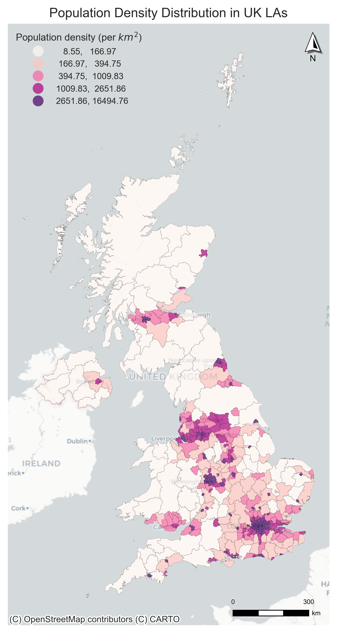
We also use a pkg called contextily to add the basemap for the static map; the doc can be found at this page.
Note: We need to use Web Mercator (epsg=3857) to map the base map and gdf.
import contextily as cx
# Plot the choropleth map of population distribution
# Create a figure and axis
fig, ax = plt.subplots(figsize=(8, 10), dpi=300)

# Plot the UK LAs
gdf_las_pop = gdf_las_pop.to_crs(epsg=3857)
gdf_las_pop.plot(ax=ax, # ax is the axis to plot on
                  column='density', # column name to tailor the choropleth map, here is the numerical data
                  scheme = 'Quantiles', # classification method
                  cmap='RdPu', # color map
                  edgecolor='black', # color of the polygon boundary
                  linewidth=0.1, # linewidth of the polygon boundary
                  alpha=0.7, # transparency of the all colors
                  legend=True,
                  legend_kwds={ "title": "Population density (per $km^2$)", # legend title
                                "fontsize":8, # legend label font size
                                "title_fontsize": 9, # legend title font size
                                "loc": "upper left", # legend position
                                "frameon": False,
                                    },
                  )

# Add the basemap
cx.add_basemap(ax, source=cx.providers.CartoDB.Positron, zoom=6)

# Add the North Arrow and scale bar to the map
north_arrow(ax, location="upper right", rotation={"crs": gdf_las_pop.crs, "reference": "center"})
scale_bar(ax, location="lower right", style="boxes", bar={"projection": gdf_las_pop.crs})
# Set the title
ax.set_title('Population Density Distribution in UK LAs')
ax.set_xlabel('Easting (m)')
ax.set_ylabel('Northing (m)')
ax.axis('off')
plt.savefig("fig/uk_la_pop_den_map_base_map.jpg", dpi=300, bbox_inches='tight')
plt.show()
3.2 Interactive maps#
Interactive maps are maps that allow users to interact with the map by zooming, panning, and clicking on features. They are used to visualize geospatial data in a more dynamic way. There are several libraries in Python that can be used to create interactive maps, such as Folium, Plotly, and Bokeh.
We will use Folium to create interactive maps in this section. The Folium library is built on the Leaflet.js library, which is a popular JavaScript library for creating interactive maps. Folium allows us to create interactive maps using Python and provides a simple interface for adding layers, markers, and popups to the map. We continue to use the TfL Underground stations, Bus Stops, and UK population data to create interactive maps.
import folium
Note that we need to use the latitude and longitude coordinates, i.e., the WGS84 coordinate system (EPSG:4326) to create the map (Folium creat the html). Use the m, the jupyter widget, to show the map in the notebook. If you want to save the map as an HTML file, you can use the m.save() function.
# Create a map centered on London
# The basemap is provided by the OpenStreetMap.
m = folium.Map(location=[51.5074, -0.1278], # center of London
               tiles='OpenStreetMap', # basemap
               zoom_start=12) # initial zoom level
m
# m.save("fig/london_map.html")
Use m.save() to save the map as an HTML file and open with any browser app. If your computer ram is limited, then use m cannot show in jupyter-lab efficiently.
3.2.1 Circle and CircleMarker#
CircleMarker has a radius specified in pixels, while Circle is specified in meters. That means a CircleMarker will not change size on your screen when you zoom, while Circle will have a fixed position on the map.
There are two different functions in folium to create the circle and circle marker.
For the data formats (e.g., numpy array, pandas) have the coordinates (x, y),
folium.Circle():folium.CircleMarker():
Only for geopandas GeoDataFrame (gdf) with the geometry column. Check the documentation for more details:
folium.GeoJson(marker = folium.Circle()):folium.GeoJson(marker = folium.CircleMarker()):
Now we use the london TfL Bus Stops (19k) to create an interactive map using folium.Cricle() and folium.GeoJson(marker = folium.Circle()).
# transfer the coordinate system of the London bus stops to WGS84
gdf_bus_stop = gdf_bus_stop.to_crs("EPSG:4326")
# select the columns we need
gdf_bus_stop_s = gdf_bus_stop[['geometry', 'Stop_Name']]
# drop the NaN values
gdf_bus_stop_s = gdf_bus_stop_s[~gdf_bus_stop_s['Stop_Name'].isna()]
print('The numbers of bus stops:', len(gdf_bus_stop_s))
The numbers of bus stops: 19790
folium.Circle()
# Create a map centered on London
m = folium.Map(location=[51.5074, -0.1278],
               tiles='OpenStreetMap',
               zoom_start=15)

# Loop through the DataFrame and add each bus stop using folium.Circle
for _, row in gdf_bus_stop_s.iterrows():
    location = [row.geometry.y, row.geometry.x]  # lat, lon
    folium.Circle(
        location=location,
        radius=25, # radius in meters
        fill=True,
        fill_color="royalblue", # fill color
        fill_opacity=0.8, # fill opacity
        color="black", # color of the circle boundary
        weight=0.1, # weight of the circle boundary
        tooltip=f"Bus Stop Name: {row['Stop_Name']}" # tooltip is the text when hovering the circle
    ).add_to(m)
# m.save("fig/london_bus_stops.html")
# m
folium.GeoJason(marker = folium.Circle())
Here, we use folium.GeoJason(marker = folium.Circle()) and change the basemap/tiles to Cartodb Positron to see the difference. (More tiles can be found in the documentation)
# Create a map centered on London
m = folium.Map(location=[51.5074, -0.1278], # center of London
               tiles='Cartodb Positron', # basemap
               zoom_start=15) # initial zoom level

# Add the TfL Bus Stops to the map
folium.GeoJson(data=gdf_bus_stop_s,
               marker=folium.Circle(radius=25,
                                    fill_color="royalblue",
                                    fill_opacity=0.8,
                                    color="black",
                                    weight=0.1),
               tooltip=folium.GeoJsonTooltip(fields=['Stop_Name'], # tooltip is the text when hovering the circle, field is the data column name
                                             aliases=['Bus Stop Name:'],  # aliases is the text when hovering the circle
                                             )
               ).add_to(m)

m.save("fig/london_bus_stops_2.html")
# m
folium.CircleMarker()
We use the CircleMarker to plot the TfL Underground stations with the usage data. The CircleMarker can be customized with different colors, sizes, and popups.
gdf_underground_usage_s = gdf_underground_usage_s.to_crs("EPSG:4326") # convert the coordinate system to WGS84
# Create a map centered on London
m = folium.Map(location=[51.5074, -0.1278], # center of London
                tiles='OpenStreetMap', # basemap
                zoom_start=13) # initial zoom level
# Add the TfL Underground stations to the map, we use the for loop to add the circle marker one by one
for i in range(len(gdf_underground_usage_s)):
    folium.CircleMarker(location=[gdf_underground_usage_s.geometry.y.iloc[i],
                                  gdf_underground_usage_s.geometry.x.iloc[i]], # location is the latitude and longitude
                        radius=gdf_underground_usage_s['usage'].iloc[i] / 1000000, # size of the circle according to the usage
                        color='royalblue', # color of the circle
                        fill=True, # fill the circle
                        fill_color='royalblue', # fill color of the circle
                        fill_opacity=0.7, # transparency of the fill color
                        weight=0.7, # weight of the circle boundary
                        popup=gdf_underground_usage_s.iloc[i]['usage'], # popup text: usage, when clicking the circle, it will show the station name.
                        tooltip=gdf_underground_usage_s.iloc[i]['FULL_NAME'], # tooltip text: station names, when hovering the circle, it will show the station name.
                        ).add_to(m)
m.save("fig/tfl_underground_stations.html")
# m
folium.GeoJson(marker = folium.CircleMarker())
Apart from the folium.CircleMarker(), Folium also provides function folium.GeoJson(marker=folium.CircleMarker())for geopandas dataframe directly.
gdf_underground_usage_s = gdf_underground_usage_s[['geometry', 'usage', 'LINES', 'FULL_NAME']]
# Create a map centered on London
m = folium.Map(location=[51.5074, -0.1278], # center of London
                tiles='Cartodb Positron', # basemap
                zoom_start=13) # initial zoom level
# Add the TfL Underground stations to the map
folium.GeoJson(data=gdf_underground_usage_s,
               marker=folium.CircleMarker(radius=4,  fill_color="royalblue", # this is the default marker and will be used
                                          fill_opacity=0.4, color="black", weight=1), # if we do not set the style_function
               style_function=lambda x: {'fillColor': 'royalblue', # color of the circle
                                          'color': 'royalblue', # color of the circle
                                          'weight': 0.7, # weight of the circle boundary
                                          'fillOpacity': 0.7, # transparency of the fill color
                                          'radius': x['properties']['usage'] /1000000 , # size of the circle according to the usage
                                          },
               tooltip=folium.GeoJsonTooltip(fields=['FULL_NAME', 'LINES', 'usage'], # tooltip text: station names and usage
                                             aliases=['Station Name:', 'Lines:', 'Annualised Usage:'], # tooltip text: station names and usage
                                             localize=True,
                                             sticky=True,
                                             )
               ).add_to(m)

m.save("fig/tfl_underground_stations2.html")
m
3.2.2 Polygon and Choropleth map#
We use the Choropleth function in Folium to plot the population density distribution in the UK LAs. The Choropleth can be customized with different colors, popups, and tooltips as well. We also use the folium.map.CustomPane to add the labels to the map. The folium.map.CustomPane is used to create a custom pane for the map, which allows us to add custom layers to the map.
gdf_las_pop = gdf_las_pop.to_crs("EPSG:4326") # convert the coordinate system to WGS84
# Create a map centered on London
m = folium.Map(location=[55.3781, -3.4360], # center of the UK
                tiles='CartoDB positron', # basemap
                zoom_start=6) # initial zoom level

# Add the UK LAs to the map
folium.Choropleth(geo_data=gdf_las_pop,
                  data=gdf_las_pop,
                  columns=['LAD24CD', 'density'], # columns to use for the choropleth
                  key_on='feature.properties.LAD24CD', # key to use for the choropleth
                  fill_color='RdPu', # color map
                  fill_opacity=1, # transparency of the fill color
                  line_opacity=0.8, # transparency of the line
                  line_color='black', # color of the line
                  line_weight=0.1, # weight of the line
                  legend_name='Population Density (per km^2)', # legend title
                  highlight=True, # highlight the polygon when hovering
                  use_jenks=True, # use the Jenks method to classify the data (see the change of the legend)
                  ).add_to(m)

# we can use custompane to show the label, here we use the CartoDB positron only labels
folium.map.CustomPane("labels").add_to(m)
# Add the labels to the map, this layer only shows the labels
folium.TileLayer("cartodbpositrononlylabels", pane="labels").add_to(m)
# m.save("fig/uk_pop_density_la.html")
# m
<folium.raster_layers.TileLayer at 0x3126f69e0>
As the folium.Choropleth() function does not support the tooltip inherently, we can use the folium.GeoJson() function to add the tooltip to the map. The folium.GeoJson() function can be used to add a GeoJSON layer to the map, and we can use the tooltip parameter to add the tooltip to the layer. Here, we need to define the colormaps in folium.
# Create a map centered on London
m = folium.Map(location=[55.3781, -3.4360], # center of the UK
                tiles='CartoDB positron', # basemap
                zoom_start=6) # initial zoom level

# Create a colormap
import branca.colormap as cm #
# create a colormap which is a linear colormap
linear = cm.linear.RdPu_09.scale(vmin=gdf_las_pop['density'].min(),
                           vmax=gdf_las_pop['density'].max()
                                 ).to_step(10) # step here is the number of colors in the colormap
# Add the UK LAs to the map
folium.GeoJson(data=gdf_las_pop,
                style_function=lambda x: {"fillColor": linear(x['properties']['density']), # color of the polygon
                "color": "black", # color of the polygon boundary
                "weight": 0.2, # weight of the polygon boundary
                "fillOpacity": 1, # transparency of the fill color
                 },
               tooltip=folium.GeoJsonTooltip(fields=['LAD24NM', 'density'], # tooltip text: station names and usage
                                             aliases=['LA Name:', 'Population Density:'], # tooltip text: station names and usage
                                             localize=True, # localize the text
                                             sticky=True, # sticky the text
                                             ),
               popup=folium.GeoJsonPopup(
                    fields=['population'], # popup text: station names and usage
                    aliases=['Population:'], # popup text: station names and usage
                    localize=True,
                    labels=True),
                    ).add_to(m)

# Add the colormap legend
linear.caption = 'Population Density (per km2)'
linear.add_to(m)

# we can use custompane to show the label, here we use the CartoDB positron only labels
folium.map.CustomPane("labels").add_to(m)
# Add the labels to the map, this layer only shows the labels
folium.TileLayer("cartodbpositrononlylabels", pane="labels").add_to(m)
m.save("fig/uk_pop_density_la_2.html")
# m
3.2.3 Polyline#
We can use the folium.PolyLine() function or folium.GeoJson() to visualize the linestring to the map. Note that the folium.PolyLine() function is used to create a polyline (with a list of coordinates) on the map, while the folium.GeoJson() function is used to add a GeoJSON layer to the map.
We use the London cycling route data to create a map of the cycling routes in London by using `folium.GeoJson().
# Read the London cycling route data
gdf_cycle_routes = gpd.read_file("data/Cycle_Routes.geojson")
# select the columns we need
gdf_cycle_routes = gdf_cycle_routes[['geometry', 'ROUTE_NAME', 'STATUS', 'ROUTE_LENGTH_KM']]
gdf_cycle_routes
| geometry | ROUTE_NAME | STATUS | ROUTE_LENGTH_KM | |
|---|---|---|---|---|
| 0 | LINESTRING Z (-0.11025 51.529 0, -0.1103 51.52... | Finsbury Park to Highbury Fields | Feasibility | 0.566 |
| 1 | LINESTRING Z (-0.11475 51.46328 0, -0.11458 51... | Brixton to Clapham High Street | Complete | 1.315 |
| 2 | MULTILINESTRING Z ((-0.20319 51.51629 0, -0.20... | Pembridge Square to Meanwhile Gardens | Complete | 2.296 |
| 3 | MULTILINESTRING Z ((-0.16325 51.51393 0, -0.16... | Hyde Park to Paddington | Feasibility | 0.757 |
| 4 | LINESTRING Z (-0.12373 51.52611 0, -0.12331 51... | Euston to Holborn | Complete | 1.181 |
| ... | ... | ... | ... | ... |
| 161 | MULTILINESTRING Z ((-0.11858 51.50975 0, -0.11... | Blomsbury to Embankment | Complete | 1.421 |
| 162 | LINESTRING Z (-0.15988 51.55558 0, -0.15913 51... | Elephant and Castle to Hampstead | Complete | 1.833 |
| 163 | LINESTRING Z (-0.33154 51.45099 0, -0.33132 51... | Brentford to Twickenham | Complete | 4.291 |
| 164 | LINESTRING Z (-0.04217 51.49002 0, -0.04295 51... | London Bridge to Rotherhithe Roundabout | In Progress | 1.335 |
| 165 | LINESTRING Z (-0.20691 51.4963 0, -0.20774 51.... | Kensington High St to Shepherds Bush | Complete | 1.151 |
166 rows × 4 columns
# plot the cycling routes using folium.GeoJson()
# Create a map centered on London
m = folium.Map(location=[51.5074, -0.1278], # center of London
                tiles='CartoDB positron', # basemap
                zoom_start=13) # initial zoom level
# Add the cycling routes to the map
folium.GeoJson(data=gdf_cycle_routes,
               style_function=lambda x: {"color": "green", # color of the line
                                          "weight": 4 , # weight of the line according to the route length
                                          "opacity": 0.6, # transparency of the line
                                          },
               tooltip=folium.GeoJsonTooltip(fields=['ROUTE_NAME'], # tooltip text: route names
                                             aliases=['ROUTE_NAME:'],
                                             )
               ).add_to(m)
m.save("fig/london_cycle_route.html")
m
3.2.4 Map layer control and other plugins#
Using the folium.LayerControl() function, we can add the layer control to the map. The layer control allows us to toggle the visibility of different layers on the map. We can also use other plugins in Folium to add more functionality to the map, such as adding a search bar, adding a measure tool, and adding a fullscreen button. You can check the documentation for more details.
Now we use the london boundary data, TfL Underground stations, and Bus Stops to create an interactive map with the layer control and other plugins. we need three main functions to help use organise the map layers: folium.TileLayer() folium.FeatureGroup() and folium.LayerControl().
# london boundary and transform the coordinate system to WGS84
gdf_london_boundary = gdf_london_boundary.to_crs("EPSG:4326")
gdf_london_boundary
| name | geometry | |
|---|---|---|
| 0 | Greater London | POLYGON ((-0.16419 51.32604, -0.16308 51.33026... |
# 1 Create a map centered on London without the basemap
m = folium.Map(location=[51.5074, -0.1278], # center of London
                zoom_start=14,
                tiles=None)

# 2 Add a basemap layer first and set a name for the layer (we can also add other basemaps)
folium.TileLayer('CartoDB positron', name='London transport stations').add_to(m)


# 3 Add the London boundary in a feature group, then add to the map
fg_boundary = folium.FeatureGroup(name='London Boundary') # 1. create a feature group for the London boundary
folium.GeoJson(data=gdf_london_boundary,
               style_function=lambda x: {"fillColor": "lightgrey", # color of the polygon
                                          "color": "black", # color of the polygon boundary
                                          "weight": 0.5, # weight of the polygon boundary
                                          "fillOpacity": 0.2, # transparency of the fill color
                                          },
                    ).add_to(fg_boundary) # 2. add the London boundary to the feature group
fg_boundary.add_to(m) # 3. add the feature group to the map

# 4 Add the TfL Underground stations in a feature group, then add to the map
fg_underground_stations = folium.FeatureGroup(name='TfL Underground Stations')
folium.GeoJson(data=gdf_underground_usage_s,
               marker=folium.Circle(radius=50, fill_color="Red", fill_opacity=0.8, color="black", weight=1),
               tooltip=folium.GeoJsonTooltip(fields=['FULL_NAME', 'LINES', 'usage'],
                                             aliases=['Station Name:', 'Lines:', 'Annualised Usage:'],
                                             localize=True,
                                             sticky=True,
                                             )
               ).add_to(fg_underground_stations)
fg_underground_stations.add_to(m)

# 5 Add the TfL Bus Stops in a feature group, then add to the map
fg_bus_stops = folium.FeatureGroup(name='TfL Bus Stops')
folium.GeoJson(data=gdf_bus_stop_s,
               marker=folium.Circle(radius=20, fill_color="royalblue", fill_opacity=0.7, color="black", weight=0.5),
               tooltip=folium.GeoJsonTooltip(fields=['Stop_Name'],
                                             aliases=['Bus Stop Name:'],
                                             localize=True,
                                             sticky=True,
                                             )
               ).add_to(fg_bus_stops)
fg_bus_stops.add_to(m)

# 6 Add the Fullscreen plugins
from folium import plugins
plugins.Fullscreen(
    position="topright",
    title="Expand me",
    title_cancel="Exit me",
    force_separate_button=True,
).add_to(m)

# 7 Add the Measure plugins
plugins.Draw(export=True).add_to(m)
# add the geocoder search bar
plugins.Geocoder().add_to(m)
# 7 Add the layer control to the map
folium.LayerControl(collapsed=False).add_to(m)
m.save("fig/london_transport_stations_bus_stop.html")
# m
Quiz#
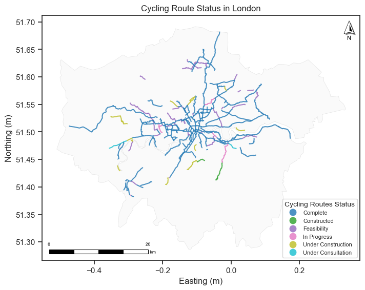
Q1: Use London cycling route data (
data/Cycle_Routes.geojson) or you can use thegdf_cycle_routesto create a static map of the cycling routes in London. In the map, the color of the cycling routes should be plotted according to the status of the route (use the [‘STATUS’] column). And this map should have a London boundary, north arrow, legend, and scale bar.Q2: Use the London floo-risk data (you can find the data under the
data/flood_risk_Londonfolder) to explore the geodataframe:What is the coordinate system of the data?
What is the column name for the flooding risk level?
How many unique flooding risk levels are there?
Calculate the area of the flooding risk polygons and print the total areas of different flooding risk levels.
Create a static map of the flooding risk areas in London and use different colors to represent different flooding risk levels.
Q3: Use the London floo-risk data to create an interactive map, the flooding areas should be colored by the flooding risk level. You need to set the
style_functionparameters. Add a geocode search bar to the map and search forLondon Eyeto determine the flood risk level of its location.
Q1 solution:
gdf_cycle_routes
| geometry | ROUTE_NAME | STATUS | ROUTE_LENGTH_KM | |
|---|---|---|---|---|
| 0 | LINESTRING Z (-0.11025 51.529 0, -0.1103 51.52... | Finsbury Park to Highbury Fields | Feasibility | 0.566 |
| 1 | LINESTRING Z (-0.11475 51.46328 0, -0.11458 51... | Brixton to Clapham High Street | Complete | 1.315 |
| 2 | MULTILINESTRING Z ((-0.20319 51.51629 0, -0.20... | Pembridge Square to Meanwhile Gardens | Complete | 2.296 |
| 3 | MULTILINESTRING Z ((-0.16325 51.51393 0, -0.16... | Hyde Park to Paddington | Feasibility | 0.757 |
| 4 | LINESTRING Z (-0.12373 51.52611 0, -0.12331 51... | Euston to Holborn | Complete | 1.181 |
| ... | ... | ... | ... | ... |
| 161 | MULTILINESTRING Z ((-0.11858 51.50975 0, -0.11... | Blomsbury to Embankment | Complete | 1.421 |
| 162 | LINESTRING Z (-0.15988 51.55558 0, -0.15913 51... | Elephant and Castle to Hampstead | Complete | 1.833 |
| 163 | LINESTRING Z (-0.33154 51.45099 0, -0.33132 51... | Brentford to Twickenham | Complete | 4.291 |
| 164 | LINESTRING Z (-0.04217 51.49002 0, -0.04295 51... | London Bridge to Rotherhithe Roundabout | In Progress | 1.335 |
| 165 | LINESTRING Z (-0.20691 51.4963 0, -0.20774 51.... | Kensington High St to Shepherds Bush | Complete | 1.151 |
166 rows × 4 columns
# You can use the gdf_cycle_route we created in the previous section, and we use geopandas to plot the static map.
# Create a figure and axis
fig, ax = plt.subplots(figsize=(8, 8))
# Plot the London boundary
gdf_london_boundary.plot(ax=ax, # ax is the axis to plot on
                          color='lightgrey', # color of the polygon
                          edgecolor='black', # color of the boundary
                          alpha=0.1, # transparency of all colors
                          linewidth=0.5) # linewidth of the polygon boundary
# The cycling routes plot
gdf_cycle_routes.plot(ax=ax,
                      column='STATUS', # column name to tailor the dot map, here is the categorical data
                      cmap='tab10', # color map
                      alpha=0.8,
                      legend = True,
                      legend_kwds = {"loc" : "lower right", # legend position
                                     "fontsize": 8, # legend label font size
                                     "title_fontsize": 10, # legend title font size
                                     "title": "Cycling Routes Status", # legend title
                                    },
                      )

# Add the North Arrow and scale bar to the map
north_arrow(ax, location="upper right", rotation={"crs": gdf_cycle_routes.crs, "reference": "center"})
scale_bar(ax, location="lower left", style="boxes", bar={"projection": gdf_cycle_routes.crs})
# Set the title
ax.set_title('Cycling Route Status in London')
ax.set_xlabel('Easting (m)')
ax.set_ylabel('Northing (m)')
plt.show()
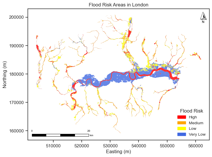
Q2 solution:
# Read the London flood risk data
gdf_flood_risk = gpd.read_file("data/flood_risk_London/RoFRS_London.shp")
gdf_flood_risk.crs
<Projected CRS: EPSG:27700>
Name: OSGB36 / British National Grid
Axis Info [cartesian]:
- E[east]: Easting (metre)
- N[north]: Northing (metre)
Area of Use:
- name: United Kingdom (UK) - offshore to boundary of UKCS within 49°45'N to 61°N and 9°W to 2°E; onshore Great Britain (England, Wales and Scotland). Isle of Man onshore.
- bounds: (-9.01, 49.75, 2.01, 61.01)
Coordinate Operation:
- name: British National Grid
- method: Transverse Mercator
Datum: Ordnance Survey of Great Britain 1936
- Ellipsoid: Airy 1830
- Prime Meridian: Greenwich
# we found the risk level is in the column 'PROB_4BAND'
gdf_flood_risk
| OBJECTID | PROB_4BAND | SUITABILIT | PUB_DATE | SHAPE_Leng | SHAPE_Area | geometry | |
|---|---|---|---|---|---|---|---|
| 0 | 51657 | High | County to Town | 20180328 | 154.684691 | 223.985278 | POLYGON ((533783.154 158782.957, 533783.149 15... |
| 1 | 51662 | High | County to Town | 20180328 | 27.586314 | 23.741519 | POLYGON ((533777.986 158805, 533775 158805, 53... |
| 2 | 51890 | High | County to Town | 20180328 | 1304.269103 | 3885.963947 | POLYGON ((533173.59 159630, 533170.35 159622.0... |
| 3 | 51936 | High | County to Town | 20180328 | 382.747355 | 701.640792 | POLYGON ((533155 159663.871, 533155 159660, 53... |
| 4 | 51937 | High | County to Town | 20180328 | 13.698716 | 7.911297 | POLYGON ((533015 159776.44, 533010.556 159780,... |
| ... | ... | ... | ... | ... | ... | ... | ... |
| 17218 | 1270196 | Very Low | Town to Street | 20180328 | 3718.106019 | 134032.404292 | POLYGON ((537600 199185.854, 537600 199150, 53... |
| 17219 | 1270200 | Very Low | Town to Street | 20180328 | 2558.957375 | 56558.336629 | POLYGON ((537650 199434.633, 537650 199400, 53... |
| 17220 | 1270201 | Very Low | Town to Street | 20180328 | 99.845313 | 124.410861 | POLYGON ((537550 199558.086, 537546.96 199561.... |
| 17221 | 1270202 | Very Low | Town to Street | 20180328 | 1259.917295 | 36923.341337 | POLYGON ((537450 199119.375, 537450 199150, 53... |
| 17222 | 1270204 | Very Low | Town to Street | 20180328 | 383.290683 | 6149.534341 | POLYGON ((537600 199754.275, 537600 199750, 53... |
17223 rows × 7 columns
# risk area/polygon unique numbers
print('risk area/polygon numbers', gdf_flood_risk.geometry.nunique())
risk area/polygon numbers 17223
gdf_flood_risk.PROB_4BAND.unique()
array(['High', 'Low', 'Medium', 'Very Low'], dtype=object)
# calculate the area of the flood risk polygons
gdf_flood_risk['polygon_area'] = gdf_flood_risk.geometry.area #m2
gdf_flood_risk
| OBJECTID | PROB_4BAND | SUITABILIT | PUB_DATE | SHAPE_Leng | SHAPE_Area | geometry | polygon_area | |
|---|---|---|---|---|---|---|---|---|
| 0 | 51657 | High | County to Town | 20180328 | 154.684691 | 223.985278 | POLYGON ((533783.154 158782.957, 533783.149 15... | 12.142567 |
| 1 | 51662 | High | County to Town | 20180328 | 27.586314 | 23.741519 | POLYGON ((533777.986 158805, 533775 158805, 53... | 9.721701 |
| 2 | 51890 | High | County to Town | 20180328 | 1304.269103 | 3885.963947 | POLYGON ((533173.59 159630, 533170.35 159622.0... | 3855.618494 |
| 3 | 51936 | High | County to Town | 20180328 | 382.747355 | 701.640792 | POLYGON ((533155 159663.871, 533155 159660, 53... | 701.640792 |
| 4 | 51937 | High | County to Town | 20180328 | 13.698716 | 7.911297 | POLYGON ((533015 159776.44, 533010.556 159780,... | 7.911297 |
| ... | ... | ... | ... | ... | ... | ... | ... | ... |
| 17218 | 1270196 | Very Low | Town to Street | 20180328 | 3718.106019 | 134032.404292 | POLYGON ((537600 199185.854, 537600 199150, 53... | 134032.404292 |
| 17219 | 1270200 | Very Low | Town to Street | 20180328 | 2558.957375 | 56558.336629 | POLYGON ((537650 199434.633, 537650 199400, 53... | 56558.336629 |
| 17220 | 1270201 | Very Low | Town to Street | 20180328 | 99.845313 | 124.410861 | POLYGON ((537550 199558.086, 537546.96 199561.... | 124.410861 |
| 17221 | 1270202 | Very Low | Town to Street | 20180328 | 1259.917295 | 36923.341337 | POLYGON ((537450 199119.375, 537450 199150, 53... | 36923.341337 |
| 17222 | 1270204 | Very Low | Town to Street | 20180328 | 383.290683 | 6149.534341 | POLYGON ((537600 199754.275, 537600 199750, 53... | 6149.534341 |
17223 rows × 8 columns
# print the total areas of different risk levels
gdf_flood_risk[['PROB_4BAND', 'polygon_area']].groupby('PROB_4BAND').sum()['polygon_area'] / 1e6  # km2
PROB_4BAND
High        49.446792
Low         44.774430
Medium      35.108733
Very Low    95.499641
Name: polygon_area, dtype: float64
gdf_flood_risk
| OBJECTID | PROB_4BAND | SUITABILIT | PUB_DATE | SHAPE_Leng | SHAPE_Area | geometry | polygon_area | |
|---|---|---|---|---|---|---|---|---|
| 0 | 51657 | High | County to Town | 20180328 | 154.684691 | 223.985278 | POLYGON ((533783.154 158782.957, 533783.149 15... | 12.142567 |
| 1 | 51662 | High | County to Town | 20180328 | 27.586314 | 23.741519 | POLYGON ((533777.986 158805, 533775 158805, 53... | 9.721701 |
| 2 | 51890 | High | County to Town | 20180328 | 1304.269103 | 3885.963947 | POLYGON ((533173.59 159630, 533170.35 159622.0... | 3855.618494 |
| 3 | 51936 | High | County to Town | 20180328 | 382.747355 | 701.640792 | POLYGON ((533155 159663.871, 533155 159660, 53... | 701.640792 |
| 4 | 51937 | High | County to Town | 20180328 | 13.698716 | 7.911297 | POLYGON ((533015 159776.44, 533010.556 159780,... | 7.911297 |
| ... | ... | ... | ... | ... | ... | ... | ... | ... |
| 17218 | 1270196 | Very Low | Town to Street | 20180328 | 3718.106019 | 134032.404292 | POLYGON ((537600 199185.854, 537600 199150, 53... | 134032.404292 |
| 17219 | 1270200 | Very Low | Town to Street | 20180328 | 2558.957375 | 56558.336629 | POLYGON ((537650 199434.633, 537650 199400, 53... | 56558.336629 |
| 17220 | 1270201 | Very Low | Town to Street | 20180328 | 99.845313 | 124.410861 | POLYGON ((537550 199558.086, 537546.96 199561.... | 124.410861 |
| 17221 | 1270202 | Very Low | Town to Street | 20180328 | 1259.917295 | 36923.341337 | POLYGON ((537450 199119.375, 537450 199150, 53... | 36923.341337 |
| 17222 | 1270204 | Very Low | Town to Street | 20180328 | 383.290683 | 6149.534341 | POLYGON ((537600 199754.275, 537600 199750, 53... | 6149.534341 |
17223 rows × 8 columns
# Plot the flood risk areas using geopandas
# Create a figure and axis
import matplotlib.patches as mpatches
fig, ax = plt.subplots(figsize=(8, 8))
# plot the flood risk levels with different colors, the colormap can distinguish the risk levels, we can use lopp to plot the different risk level polygon
# Define the color map manually
risk_colors = {
    'High': 'red',
    'Medium': 'orange',
    'Low': 'yellow',
    'Very Low': 'royalblue'
}

# Plot each risk level
for level, color in risk_colors.items():
    gdf_flood_risk[gdf_flood_risk['PROB_4BAND'] == level].plot(ax=ax,
                                                                color=color,
                                                                edgecolor='black',
                                                                alpha=0.8,
                                                                linewidth=0.01)

# Create custom legend handles
legend_handles = [mpatches.Patch(color=color, label=level) for level, color in risk_colors.items()]
ax.legend(handles=legend_handles, loc='lower right', fontsize=10, title='Flood Risk', title_fontsize=12, frameon=False)
# Add the North Arrow and scale bar to the map
north_arrow(ax, location="upper right", rotation={"crs": gdf_flood_risk.crs, "reference": "center"})
scale_bar(ax, location="lower left", style="boxes", bar={"projection": gdf_flood_risk.crs})
# Set the title
ax.set_title('Flood Risk Areas in London')
ax.set_xlabel('Easting (m)')
ax.set_ylabel('Northing (m)')
plt.show()
Q3 solution:
gdf_flood_risk = gdf_flood_risk.to_crs("EPSG:4326") # convert the coordinate system to WGS84
# Create a map centered on London
m = folium.Map(location=[51.5074, -0.1278], # center of London
                tiles='OpenStreetMap', # basemap
                zoom_start=12) # initial zoom level
# Add the London flood risk data to the map, and we plot the color of the polygon according to the flood risk levels
folium.GeoJson(data=gdf_flood_risk,
               style_function=lambda x: {"fillColor": "red" if x['properties']['PROB_4BAND'] == 'High' else "orange" if x['properties']['PROB_4BAND'] == 'Medium' else "yellow" if x['properties']['PROB_4BAND'] == 'Low' else "royalblue", # color of the polygon
                                          "color": "black", # color of the polygon boundary
                                          "weight": 0.1, # weight of the polygon boundary
                                          "fillOpacity": 0.5, # transparency of the fill color
                                          },
               tooltip=folium.GeoJsonTooltip(fields=['PROB_4BAND'], # tooltip text: flood risk levels
                                             aliases=['Flood Risk Level:'],
                                             )
               ).add_to(m)
# Add a geocode search bar to the map.
plugins.Geocoder().add_to(m)
m.save("fig/london_flood_risk.html")
# m