Week6 Lab Tutorial Timeline
Time |
Activity |
|---|---|
16:00–16:05 |
Introduction — Overview of the main tasks for the lab tutorials |
16:05–16:45 |
Tutorial: Temporal data processing and modelling — Follow Section 6.1-6.2 of the Jupyter Notebook to practice the ACF, PACF, MA, AR and ARMA models |
16:45–17:30 |
Tutorial: Temporal data processing and modelling — Follow Section 6.3-6.4 of the Jupyter Notebook to practice the ARIMA, SARIMA |
17:30–17:55 |
Quiz — Complete quiz tasks |
17:55–18:00 |
Wrap-up — Recap key points and address final questions |
For this module’s lab tutorials, you can download all the required data using the provided link (click).
Please make sure that both the Jupyter Notebook file and the data and img folder are placed in the same directory (specifically within the STBDA_lab folder) to ensure the code runs correctly.
Week 6 Key Takeaways:
Understand the concepts of time series decomposition, stationarity, and differencing.
Learn how to calculate and interpret autocorrelation (ACF) and partial autocorrelation (PACF) functions.
Explore the moving average (MA), autoregressive (AR), and autoregressive moving average (ARMA) models.
Understand the autoregressive integrated moving average (ARIMA) model and its parameters.
Learn how to implement and evaluate ARIMA and SARIMA models for time series forecasting.
Gain practical experience in temporal data processing and modeling using Python libraries such as
statsmodelsandpandas.
6 Temporal data processing and modelling#
import pandas as pd
import numpy as np
import warnings
warnings.filterwarnings('ignore')
6.1 Autocorrelations in time series#
A time series is a collection of data points ordered in time index. Typically, these data points are spaced at consistent intervals, such as hourly, monthly, or yearly.
Time series decomposition is a process by which we separate a time series into its components: trend, seasonality, and residuals.
The trend represents the slow-moving changes in a time series. It is responsible for making the series gradually increase or decrease over time.
The seasonality component represents the seasonal pattern in the series. The cycles occur repeatedly over a fixed period of time.
The residuals represent the behavior that cannot be explained by the trend and seasonality components. They correspond to random errors, also termed white noise.
6.1.1 Stationarity#
A stationary time series is one whose statistical properties do not change over time.
In other words, it has a constant mean, variance, and auto-correlation, and these properties are independent of time.
Some models assume stationarity: The moving average model (MA), autoregressive model (AR), and autoregressive moving average model(ARMA).
Augmented Dickey-Fuller (ADF) test
The augmented Dickey-Fuller (ADF) test helps us determine if a time series is stationary by testing for the presence of a unit root.
If a unit root is present, the time series is not stationary.
The null hypothesis states that a unit root is present, meaning that our time series is not stationary.
\(p < 0.05\) –> Reject null hypothesis (time series is not stationary) –> Time series is stationary
\(p > 0.05\) –> Accept (cannot reject) null hypothesis (time series is not stationary) –> Time series is not stationary
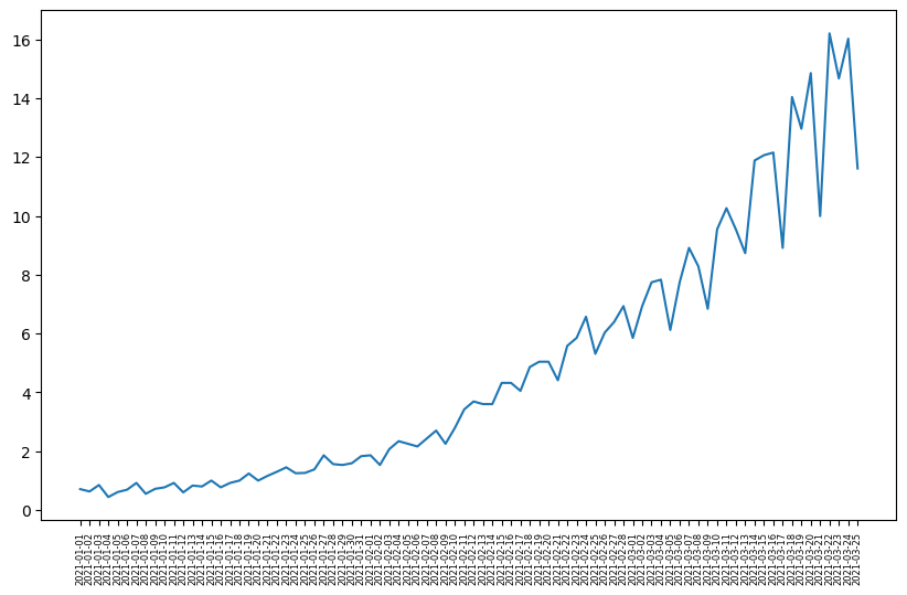
# load the sample data
df_data = pd.read_csv('data/ts_sample_data.csv', index_col=0)
df_data
| date | data | |
|---|---|---|
| 0 | 2021-01-01 | 0.71 |
| 1 | 2021-01-02 | 0.63 |
| 2 | 2021-01-03 | 0.85 |
| 3 | 2021-01-04 | 0.44 |
| 4 | 2021-01-05 | 0.61 |
| ... | ... | ... |
| 79 | 2021-03-21 | 9.99 |
| 80 | 2021-03-22 | 16.20 |
| 81 | 2021-03-23 | 14.67 |
| 82 | 2021-03-24 | 16.02 |
| 83 | 2021-03-25 | 11.61 |
84 rows × 2 columns
# plot the time series data
import matplotlib.pyplot as plt
plt.figure(figsize=(10, 6))
plt.plot(df_data.date.values, df_data.data.values)
plt.xticks(fontsize=6, rotation=90)  # Adjust font size and rotation angle
plt.show()
from statsmodels.tsa.stattools import adfuller
# ADF test
ADF_result = adfuller(df_data.data)
print(f'ADF Statistic: {ADF_result[0]}')
print(f'p-value: {ADF_result[1]}')
ADF Statistic: 2.7420165734574753
p-value: 1.0
Interpretation: The p-value greater than 0.05, we accept (cannot reject) the null hypothesis, so time series is not stationary.
6.1.2 Differencing#
Differencing in time series is a technique used to make a time series stationary by removing trends or seasonality.
One-Step differencing
diff_data1 = np.diff(df_data.data, n=1) # n=1 is one-step
print(df_data.data.values)
[ 0.71      0.63      0.85      0.44      0.61      0.69      0.92
  0.55      0.72      0.77      0.92      0.6       0.83      0.8
  1.        0.77      0.92      1.        1.24      1.        1.16
  1.3       1.45      1.25      1.26      1.38      1.86      1.56
  1.53      1.59      1.83      1.86      1.53      2.07      2.34
  2.25      2.16      2.43      2.7       2.25      2.79      3.42
  3.69      3.6       3.6       4.32      4.32      4.05      4.86
  5.04      5.04      4.41      5.58      5.85      6.57      5.31
  6.03      6.39      6.93      5.85      6.93      7.74      7.83
  6.12      7.74      8.91      8.28      6.84      9.54     10.26
  9.54      8.729999 11.88     12.06     12.15      8.91     14.04
 12.96     14.85      9.99     16.2      14.67     16.02     11.61    ]
print(diff_data1) # -0.08 = 0.63(y_t) - 0.71(y_t-1)
[-0.08      0.22     -0.41      0.17      0.08      0.23     -0.37
  0.17      0.05      0.15     -0.32      0.23     -0.03      0.2
 -0.23      0.15      0.08      0.24     -0.24      0.16      0.14
  0.15     -0.2       0.01      0.12      0.48     -0.3      -0.03
  0.06      0.24      0.03     -0.33      0.54      0.27     -0.09
 -0.09      0.27      0.27     -0.45      0.54      0.63      0.27
 -0.09      0.        0.72      0.       -0.27      0.81      0.18
  0.       -0.63      1.17      0.27      0.72     -1.26      0.72
  0.36      0.54     -1.08      1.08      0.81      0.09     -1.71
  1.62      1.17     -0.63     -1.44      2.7       0.72     -0.72
 -0.810001  3.150001  0.18      0.09     -3.24      5.13     -1.08
  1.89     -4.86      6.21     -1.53      1.35     -4.41    ]
# ADF test for diff data
ADF_result = adfuller(diff_data1)
print(f'ADF Statistic: {ADF_result[0]}')
print(f'p-value: {ADF_result[1]}')
ADF Statistic: -0.4074097636380228
p-value: 0.9088542416911345
Two-Step differencing as p > 0.05 (still non-stationary) after one-step.
diff_data2 = np.diff(df_data.data, n=2) # n=2 is two-step
print(diff_data1) # one-step series
[-0.08      0.22     -0.41      0.17      0.08      0.23     -0.37
  0.17      0.05      0.15     -0.32      0.23     -0.03      0.2
 -0.23      0.15      0.08      0.24     -0.24      0.16      0.14
  0.15     -0.2       0.01      0.12      0.48     -0.3      -0.03
  0.06      0.24      0.03     -0.33      0.54      0.27     -0.09
 -0.09      0.27      0.27     -0.45      0.54      0.63      0.27
 -0.09      0.        0.72      0.       -0.27      0.81      0.18
  0.       -0.63      1.17      0.27      0.72     -1.26      0.72
  0.36      0.54     -1.08      1.08      0.81      0.09     -1.71
  1.62      1.17     -0.63     -1.44      2.7       0.72     -0.72
 -0.810001  3.150001  0.18      0.09     -3.24      5.13     -1.08
  1.89     -4.86      6.21     -1.53      1.35     -4.41    ]
print(np.array([f"{_:.2f}" for _ in diff_data2])) # 0.30 = 0.22(y_k) - (-0.08)(y_k-1): k is one-step series index
['0.30' '-0.63' '0.58' '-0.09' '0.15' '-0.60' '0.54' '-0.12' '0.10'
 '-0.47' '0.55' '-0.26' '0.23' '-0.43' '0.38' '-0.07' '0.16' '-0.48'
 '0.40' '-0.02' '0.01' '-0.35' '0.21' '0.11' '0.36' '-0.78' '0.27' '0.09'
 '0.18' '-0.21' '-0.36' '0.87' '-0.27' '-0.36' '0.00' '0.36' '0.00'
 '-0.72' '0.99' '0.09' '-0.36' '-0.36' '0.09' '0.72' '-0.72' '-0.27'
 '1.08' '-0.63' '-0.18' '-0.63' '1.80' '-0.90' '0.45' '-1.98' '1.98'
 '-0.36' '0.18' '-1.62' '2.16' '-0.27' '-0.72' '-1.80' '3.33' '-0.45'
 '-1.80' '-0.81' '4.14' '-1.98' '-1.44' '-0.09' '3.96' '-2.97' '-0.09'
 '-3.33' '8.37' '-6.21' '2.97' '-6.75' '11.07' '-7.74' '2.88' '-5.76']
# ADF test for diff data
ADF_result = adfuller(diff_data2)
print(f'ADF Statistic: {ADF_result[0]}')
print(f'p-value: {ADF_result[1]}')
ADF Statistic: -3.5851628747931454
p-value: 0.006051099869603866
Interpretation: Two-step differencing turn the time series to stationary as p < 0.05.
# plot the two-step differencing time series data
import matplotlib.pyplot as plt
plt.figure(figsize=(8, 5))
plt.plot(diff_data2)
plt.show()

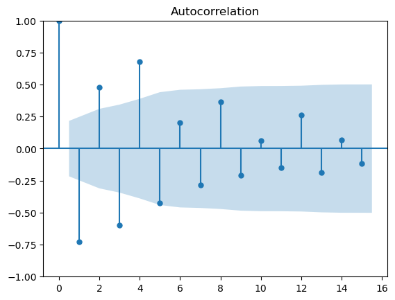
6.1.3 The autocorrelation function (ACF)#
The autocorrelation function (ACF) measures the linear relationship between lagged values of a time series.
In other words, it measures the correlation (covariance) of the time series with itself (variance).
The ACF can be denoted as:
\(\rho_k = \frac{\gamma_k}{\gamma_0}\)
where \(\gamma_0\) is the variance of the time series \(\gamma_0 = \text{Var}(x_t)\) and \(\gamma_k\) is the autocovariance.
The autocovariance function \(\gamma_k\) at lag \(k\) is given by:
\( \gamma_k = \text{Cov}(x_t, x_{t-k}) = \frac{1}{N} \sum_{t=k+1}^{N} (x_t - \mu)(x_{t-k} - \mu)\)
\(k\) is the lag;
\(x_t\) is the value at time \(t\);
\(x_{t-k}\) is the value at time \(t-k\);
\(\mu\) is the mean of the time series;
\(N\) is the number of observations.
lag refers to the number of time steps between observations being compared.
This is an example for calculating ACF (lag=2 –> k=2) for [1,3,5,7,8]
\(\mu = (1+3+5+7+8)/5 = 24/5 = 4.8\)
Numerator: \(\gamma_2 = \text{Cov}(x_t, x_{t-2}) = \frac{1}{5} \sum_{t=3}^{5} (x_t - 4.8)(x_{t-2} - \mu) = ((5-4.8)*(1-4.8)+(7-4.8)*(3-4.8)+(8-4.8)*(5-4.8))/5 = -0.816\)
Denominator: \(\gamma_0 = ((1-4.8)^2+(3-4.8)^2+(5-4.8)^2+(7-4.8)^2+(8-4.8)^2)/5=6.56\)
\(\rho_2 = -0.816 / 6.56 =-0.124\)
# Use the acf function in statsmodels for calculating this example
from statsmodels.tsa.stattools import acf
acf_values = acf([1,3,5,7,8], nlags=2)
for lag, value in enumerate(acf_values):
    print(f"Lag {lag}: {value}")
Lag 0: 1.0
Lag 1: 0.4256097560975609
Lag 2: -0.12439024390243904
from statsmodels.graphics.tsaplots import plot_acf
Interpretation for ACF plot
X-Axis: Displays the lag values.
Y-Axis: Displays the autocorrelation values (coefficients) ranging from -1 to 1.
Note that the shaded area represents a confidence interval.
If a point is within the shaded area, then it is not significantly different from 0.
Otherwise, the autocorrelation coefficient is significant. Any spike outside these bands is statistically significant.
# for the ACF plot for df_data.data after two-step differencing, the value is still auto-correlated before lag 5,
# which means diff_data2 is not a random work as it still obtains the auto-correlations.
# we can conclude that df_data is not a random walk (so we may need some models to model the patterns).
plot_acf(diff_data2,lags=15)
plt.show()
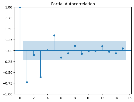
6.1.4 Partial autocorrelation function (PACF)#
It measures the correlation between lagged values in a time series when we remove the influence of the intermediate lags.
It essentially gives the partial correlation of a time series with its own lagged values, controlling for the effect of other lags.
We can plot the partial autocorrelation function to determine the order of a stationary AR(\(p\)) process.
The coefficients will be non-significant after lag \(p\).
We can use the Yule-Walker Equations to compute PACF recursively:
\(\phi_{kk} = \frac{\rho_k - \sum_{j=1}^{k-1} \phi_{k-1,j} \rho_{k-j}}{1 - \sum_{j=1}^{k-1} \phi_{k-1,j} \rho_j}\)
\(k\): The current lag at which the PACF is being computed.
\(j\): An intermediate lag index used in the summation to remove the influence of previous lags.
So, the PACF at lag \(k\) is given by: \(\phi_{kk} = \text{corr}(x_t, x_{t-k} \mid x_{t-1}, x_{t-2}, ..., x_{t-k+1})\)
This means PACF at lag \(k\) is the correlation between \(x_t\) and \(x_{t-k}\) after removing the effect of lags \( 1 \) to \( k-1 \) (i.e., removing the influence of \(x_{t-1}, x_{t-2}, ..., x_{t-k+1}\)).
This is an example for calculating PACF (lag=2 –> k=2) for [1,3,5,7,8]
for \(k=2\), \(\phi_{22} = \frac{\rho_2 - \sum_{j=1}^{1} \phi_{11} \rho_{1}}{1 - \sum_{j=1}^{1} \phi_{11} \rho_1}\) = \(\frac{\rho_2 - \phi_{11} \rho_{1}}{1 - \phi_{11} \rho_1}\)
for \(k=1\), we get \(\phi_{11} = \rho_1\)
so, \(\frac{\rho_2 - \phi_{11} \rho_{1}}{1 - \phi_{11} \rho_1}\) = \(\frac{\rho_2 - (\rho_{1})^2}{1 - {\rho_1}^2}\) = \(\frac{ -0.124 - (0.426)^2}{1 - (0.426)^2}\) = -0.373
# Use the PACF function in statsmodels for calculating this example
from statsmodels.tsa.stattools import pacf
pacf_values = pacf([1,3,5,7,8], nlags=2, method='ywm')
for lag, value in enumerate(pacf_values):
    print(f"Lag {lag}: {value}")
Lag 0: 1.0
Lag 1: 0.425609756097561
Lag 2: -0.37312272633985905
from statsmodels.graphics.tsaplots import plot_pacf
# Plot partial autocorrelation
plot_pacf(diff_data2, lags=15)
plt.show()
6.2 Time series modelling: MA(\(q\)), AR(\(p\)),ARMA (\(p\),\(q\)) models#
Roadmap of time series modelling
Part 1 Random walk approach:
A random walk is a process in which there is an equal chance of going up or down by a random number.
In other words, a random walk is a series whose first difference is stationary and uncorrelated, which means that the process moves completely at random.
Note: Because a random process takes random steps into the future, we cannot use statistical or deep learning techniques to fit such a process, i.e., there is no pattern to learn from randomness, and it cannot be predicted.
Instead, we rely on naive forecasting methods (df.shift()).
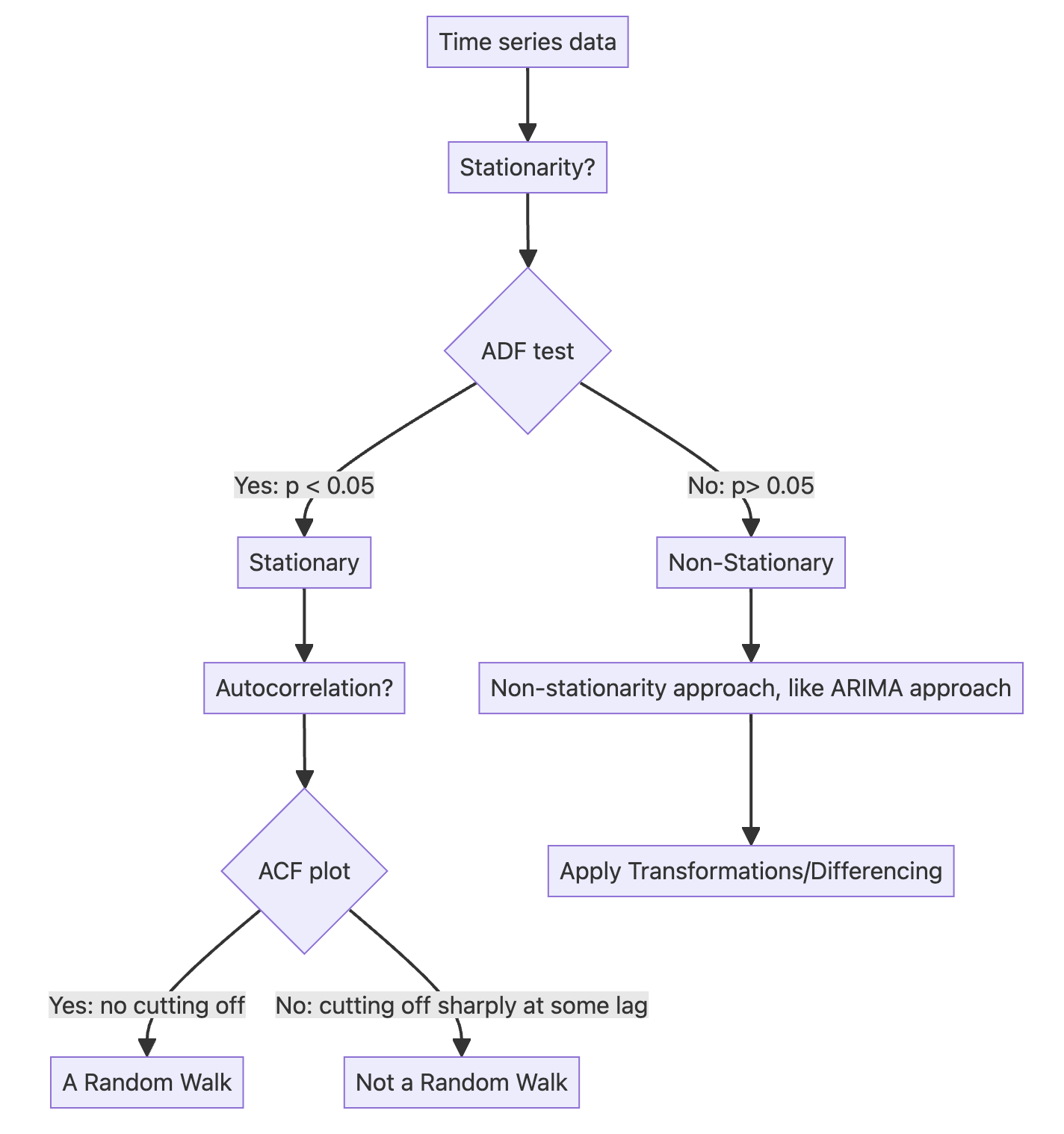
Part 2 ARIMA approach:
6.2.1 Moving average model (MA) – (\(q\)) – using ACF#
In a moving average (MA) process, the current value depends linearly on the mean of the series, the current error term, and past error terms.
The moving average model is denoted as MA(\(q\)), where \(q\) is the order.
The general expression of an MA(\(q\)) model is:
The present (\(t\)) error term \(\epsilon_t\) , and past error terms \(\epsilon_{t-q}\) ;
The magnitude of the impact of past errors on the present value is quantified using a coefficient denoted as \(\theta_q\) .
6.2.2 Autoregressive model (AR) – (\(p\)) – using PACF#
An autoregressive process is a regression of a variable against itself.
In a time series, this means that the present value is linearly dependent on its past values.
The autoregressive process is denoted as AR(\(p\)), where \(p\) is the order.
The general expression of an AR(\(p\)) model is:
A constant \(C\);
The present error term \(\epsilon_t\) , which is also white noise;
The past values of the series \(y_{t-p}\);
The magnitude of the influence of the past values on the present value is denoted as \(\phi_p\), which represents the coefficients of the AR (\(p\)) model.
6.2.3 Autoregressive moving average model (ARMA) – (\(p\), \(q\))#
The autoregressive moving average process is a combination of the autoregressive process and the moving average process.
It is denoted as ARMA(\(p\),\(q\)), where \(p\) is the order of the autoregressive process, and \(q\) is the order of the moving average process.
The general equation of the ARMA(\(p\),\(q\))model is:
Note:
An ARMA(\(0,q\)) process is equivalent to an MA(\(q\)) process, since the order \(p = 0\) cancels the AR(\(p\)) portion.
An ARMA(\(p,0\)) process is equivalent to an AR(\(p\)) process, since the order \(q = 0\) cancels the MA(\(q\)) portion.
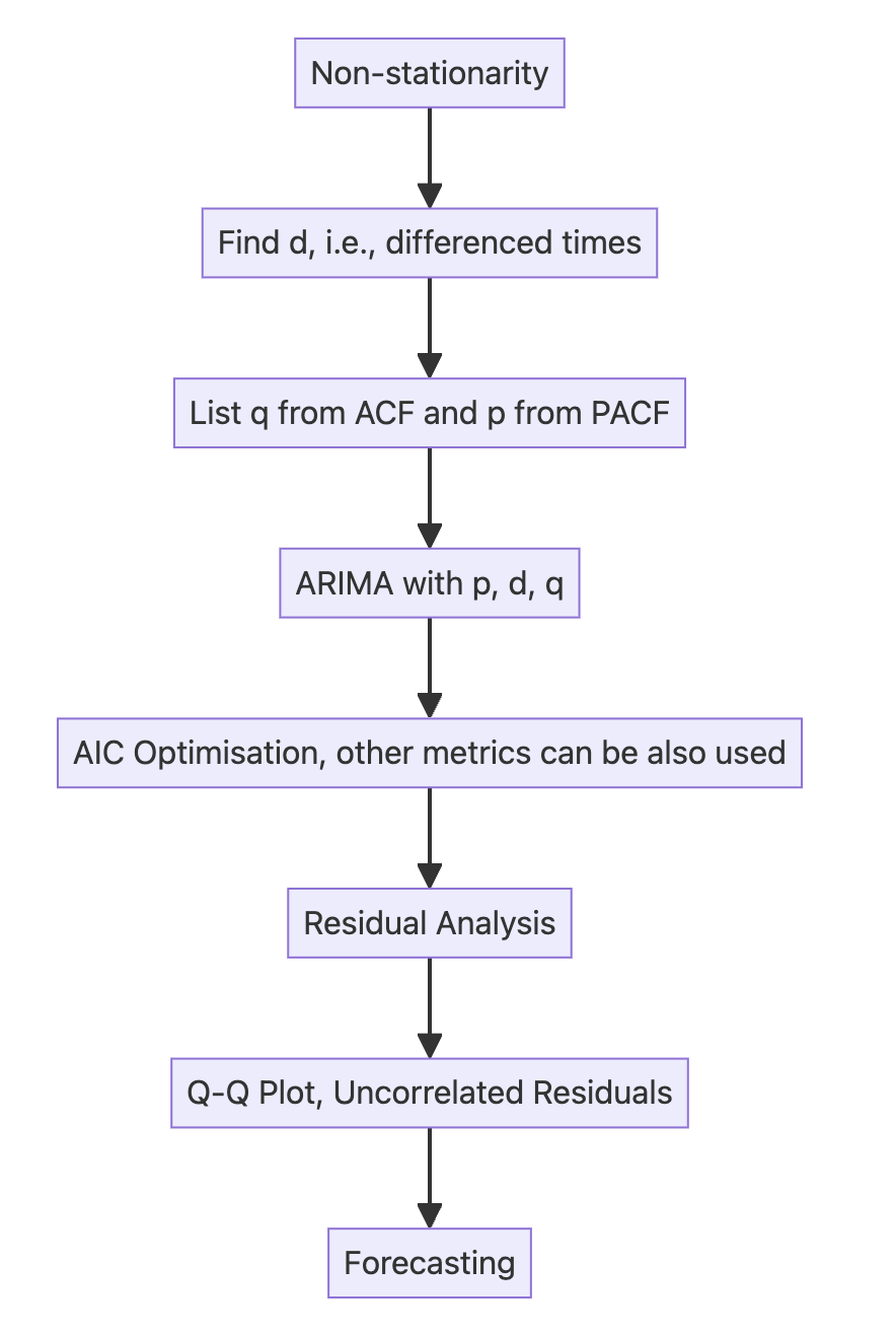
6.3 ARIMA model – (\(p\), \(d\), \(q\))#
An autoregressive integrated moving average (ARIMA) model is the combination of the AR(\(p\)) and MA(\(q\)) processes, but in terms of the differenced series.
It is denoted as ARIMA(\(p,d,q\)), where \(p\) is the order of the AR(\(p\)) process, \(d\) is the order of integration, and \(q\) is the order of the MA(\(q\)) process.
Integration is the reverse of differencing, and the order of integration \(d\) is equal to the number of times the series has been differenced to be rendered stationary.
The general equation of the ARIMA(\(p,d,q\)) process is:
\(y'_t = \Delta^d y_t\)
\(y'_t = C + \phi_1 y'_{t-1} + \dots + \phi_p y'_{t-p} + \theta_1 \epsilon'_{t-1} + \dots + \theta_q \epsilon'_{t-q} + \epsilon_t\)
Note that \(y'_t\) represents the differenced series after \(d\) times, and it may have been differenced more than once.
The Akaike information criterion (AIC) is a measure of the quality of a model in relation to other models.
It is used for model selection.
The AIC is a function of the number of parameters \(k\) in a model and the maximum value of the likelihood function \(\hat{L}\):
The lower the value of the AIC, the better the model.
Selecting according to the AIC allows us to keep a balance between the complexity of a model and its goodness of fit to the data.
SARIMAX is a complex algorithm that allows us to consider seasonal effects, autoregressive processes, non-stationary time series, moving average processes, and exogenous variables all in a single model.
Key parameters for ARIMA model in SARIMAX algorithm:
endog: time series \(y\)
order: (\(p\), \(d\), \(q\))
Step1: Set optimization function for ARIMA parameter tuning using AIC
from typing import Union
from statsmodels.tsa.statespace.sarimax import SARIMAX

def optimize_arima(endog: Union[pd.Series, list], orders_list: list, d_value: int):
    results = []
    for order in orders_list:
        try:
            train_model = SARIMAX(endog, order=(order[0], d_value, order[1])).fit(disp=False)
            aic = train_model.aic
            results.append([order, aic])
        except Exception as e:
            # Print or log the exception if needed
            print(f"Error encountered for order {order}: {str(e)}")
            continue

    # Convert results to DataFrame and sort by AIC
    results_df = pd.DataFrame(results, columns=['(p,q)', 'AIC'])
    results_df = results_df.sort_values(by='AIC', ascending=True).reset_index(drop=True)
    return results_df
Step2: Set parameter ranges
from itertools import product
ps = range(0, 4, 1) # set p range
qs = range(0, 4, 1) # set q range
d = 2 # set d (this can be range as well)
order_list = list(product(ps, qs))
print(order_list)
[(0, 0), (0, 1), (0, 2), (0, 3), (1, 0), (1, 1), (1, 2), (1, 3), (2, 0), (2, 1), (2, 2), (2, 3), (3, 0), (3, 1), (3, 2), (3, 3)]
Step3: Training
# training set and testing set
train_data = df_data.data[:-4]
test_data = df_data.data[-4:]
%%time

import warnings
warnings.filterwarnings('ignore')

result_df = optimize_arima(train_data, order_list, d)
CPU times: user 1.04 s, sys: 3.92 s, total: 4.96 s
Wall time: 516 ms
print(result_df)
     (p,q)         AIC
0   (3, 3)  115.269292
1   (3, 1)  115.624980
2   (3, 2)  115.672007
3   (3, 0)  154.430620
4   (0, 3)  194.654716
5   (0, 2)  209.274665
6   (2, 3)  220.666852
7   (1, 3)  228.267799
8   (1, 2)  228.935784
9   (2, 2)  229.974696
10  (2, 1)  234.501112
11  (1, 1)  236.117233
12  (0, 1)  252.601022
13  (2, 0)  280.299907
14  (1, 0)  280.389386
15  (0, 0)  320.324435
Step4: Selecting the best p,d,q for ARIMA
model = SARIMAX(train_data, order=(3,2,3)) # Selecting the best p,d,q for ARIMA
model_fit = model.fit(disp=False)
Step5: Residual analysis/diagnosis
# plot_diagnostics
model_fit.plot_diagnostics(figsize=(10,8))
plt.show()
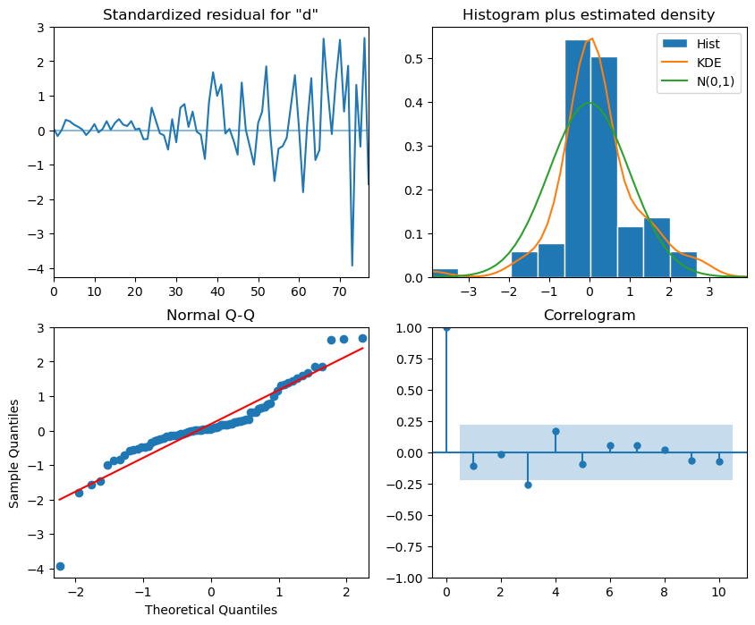
Interpretation:
The top-left plot shows the residuals over time: While there is no trend in the residuals, the variance does not seem to be constant, which is a discrepancy in comparison to white noise.
The top-right histogram shows the distribution of the residuals. The distribution is not perfectly normal, but it is close to normal, which is a good sign.
The Q-Q plot leads us to the same conclusion, as it displays a line that is fairly straight, meaning that the residuals distribution is close to a normal distribution (also shown as top-right histogram).
The correlogram at the bottom right shows no significant coefficients after lag 0, just like white noise, though a coefficient seems to be significant at lag 3 (There are no significant autocorrelation coefficients before this lag, so it can be assumed that is due to chance).
Ljung-Box test is used to determine whether the residuals are correlated.We will apply the test on the first 10 lags and study the p-values. If all p-values are greater than 0.05, we cannot reject the null hypothesis, and we’ll conclude that the residuals are not correlated, just like white noise.
from statsmodels.stats.diagnostic import acorr_ljungbox
import numpy as np
residuals = model_fit.resid
df_al = acorr_ljungbox(residuals, np.arange(1, 11, 1)) ## 10 lags
df_al['lags'] = np.arange(1, 11, 1)
df_al
| lb_stat | lb_pvalue | lags | |
|---|---|---|---|
| 1 | 1.643993 | 0.199778 | 1 |
| 2 | 1.647603 | 0.438760 | 2 |
| 3 | 7.291150 | 0.063175 | 3 |
| 4 | 9.241503 | 0.055339 | 4 |
| 5 | 9.861096 | 0.079268 | 5 |
| 6 | 10.096287 | 0.120655 | 6 |
| 7 | 10.342120 | 0.170000 | 7 |
| 8 | 10.376459 | 0.239591 | 8 |
| 9 | 10.717872 | 0.295544 | 9 |
| 10 | 11.164460 | 0.344849 | 10 |
Step6: Forecasting and testing
df_data
| date | data | |
|---|---|---|
| 0 | 2021-01-01 | 0.71 |
| 1 | 2021-01-02 | 0.63 |
| 2 | 2021-01-03 | 0.85 |
| 3 | 2021-01-04 | 0.44 |
| 4 | 2021-01-05 | 0.61 |
| ... | ... | ... |
| 79 | 2021-03-21 | 9.99 |
| 80 | 2021-03-22 | 16.20 |
| 81 | 2021-03-23 | 14.67 |
| 82 | 2021-03-24 | 16.02 |
| 83 | 2021-03-25 | 11.61 |
84 rows × 2 columns
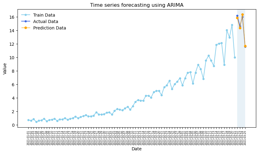
# In our case, we use the previous 80 days to train the model and predict the last 4 days.
ARIMA_pred = model_fit.get_prediction(80, 83).predicted_mean # model_fit.forecast(steps=4)
ARIMA_pred
80    15.854711
81    14.380938
82    16.367480
83    11.682536
Name: predicted_mean, dtype: float64
# Plotting
plt.figure(figsize=(10, 5))
plt.plot(df_data.date[:-4].values, train_data.values, color='skyblue', lw=1.5, marker='o', markersize=4, label='Train Data')
plt.plot(df_data.date[-4:].values, test_data.values, color='royalblue', lw=1.5, marker='o',markersize=4,label='Actual Data')
plt.plot(df_data.date[-4:].values, ARIMA_pred.values, color='orange',lw=1, marker='o', markersize=5, label='Prediction Data')

# Adding labels and title
plt.xlabel('Date')
plt.ylabel('Value')
plt.title('Time series forecasting using ARIMA')
plt.legend(frameon=False)
plt.axvspan(80,83, alpha=0.1)
plt.xticks(fontsize=6, rotation=90)  # Adjust font size and rotation angle
plt.show()
Some other metrics: MAPE, MSE
from sklearn.metrics import mean_squared_error, mean_absolute_percentage_error
# ARIMA Vs Naive(use former values represent the predicted values)
naive_pred = df_data.data[76:80]

# Calculate Mean Squared Error (MSE)
mse_a = mean_squared_error(test_data, ARIMA_pred)
mse_n = mean_squared_error(test_data, naive_pred)
print(f"ARIMA Mean Squared Error (MSE): {mse_a}", f"Naive Mean Squared Error (MSE): {mse_n}")

# Calculate Mean Absolute Percentage Error (MAPE)
mape_a = mean_absolute_percentage_error(test_data, ARIMA_pred)
mape_n = mean_absolute_percentage_error(test_data, naive_pred)
print(f"ARIMA Mean Absolute Percentage Error (MAPE): {mape_a}", f" Naive Mean Absolute Percentage Error (MAPE): {mape_n}")
ARIMA Mean Squared Error (MSE): 0.08219636088010844 Naive Mean Squared Error (MSE): 2.8957499999999987
ARIMA Mean Absolute Percentage Error (MAPE): 0.017239139124687667  Naive Mean Absolute Percentage Error (MAPE): 0.11561658552433654
6.4 SARIMA model (\(p,d,q\))(\(P,D,Q\))\(m\)#
Seasonal autoregressive integrated moving average (SARIMA) model adds seasonal parameters to the ARIMA(p,d,q) model.
It is denoted as SARIMA(\(p,d,q\))(\(P,D,Q\))\(m\), where
\(P\) is the order of the seasonal AR(\(P\)) process;
\(D\) is the seasonal order of integration;
\(Q\) is the order of the seasonal MA(\(Q\))process;
\(m\) is the frequency or the number of observations per seasonal cycle.
Note that a SARIMA(\(p,d,q\))(\(0,0,0\))\(m\) model is equivalent to an ARIMA(\(p,d,q\)) model.
6.4.1 What is frequency \(m\)?#
In SARIMA (Seasonal AutoRegressive Integrated Moving Average), the m parameter represents the seasonal period — that is, how many time steps it takes for the seasonal cycle to repeat.
\(m\) corresponds to the number of observations per seasonal cycle.
Examples:
Monthly data with yearly seasonality: \(m\) = 12
Quarterly data with yearly seasonality: \(m\) = 4
Daily data with weekly seasonality: \(m\) = 7
Hourly data with daily seasonality: \(m\) = 24
Appropriate frequency \(m\) depending on the data:
Data collection |
Frequency \(m\) (observation unit/level) in one year cycle |
|---|---|
Annual |
1 |
Quarterly |
4 |
Monthly |
12 |
Weekly |
52 |
Daily |
365 |
Hourly |
8760 |
# use the air passengers data for analysis
df_ap = pd.read_csv('data/air-passengers.csv', index_col=0)
df_ap.head()
| Passengers | |
|---|---|
| Month | |
| 1949-01 | 112 |
| 1949-02 | 118 |
| 1949-03 | 132 |
| 1949-04 | 129 |
| 1949-05 | 121 |
# set index to datetime type
df_ap.index = pd.to_datetime(df_ap.index)
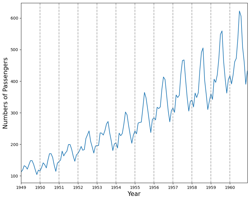
Plotting the time series data helps to observe periodic patterns (frequency).
# Plot the time series
df_ap.plot(figsize=(10, 8), legend=False)

# Add vertical lines for each year
years = pd.to_datetime(df_ap.index.year.unique().values, format='%Y')
for year in years:
    plt.axvline(x=year, color='grey', linestyle='--', alpha=0.7)

plt.xticks(years, labels=df_ap.index.year.unique().values)
plt.xlabel('Year', fontsize=15)
plt.ylabel('Numbers of Passengers', fontsize=15)
plt.show()
Another way of identifying seasonal patterns is using time series decomposition.
Note: In a time series without a seasonal pattern, the decomposition process will show the seasonal component as a flat horizontal line at 0.
## decomposition of time series
from statsmodels.tsa.seasonal import STL
decomposition = STL(df_ap['Passengers'], period=12).fit()
fig, (ax1, ax2, ax3, ax4) = plt.subplots(nrows=4, ncols=1, sharex=True, figsize=(8,6))
ax1.plot(decomposition.observed)
ax1.set_ylabel('Observed')
ax2.plot(decomposition.trend)
ax2.set_ylabel('Trend')
ax3.plot(decomposition.seasonal)
ax3.set_ylabel('Seasonal')
ax4.plot(decomposition.resid)
ax4.set_ylabel('Residuals')
fig.autofmt_xdate()
plt.tight_layout()
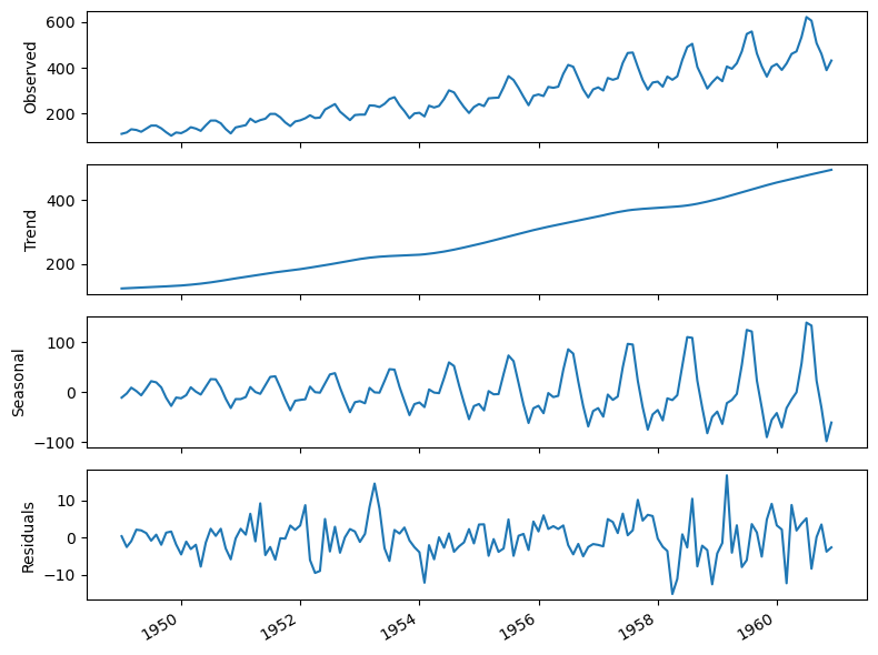
Interpretation:
The summer months (July and August) usually have the highest numbers of air passengers in one year;
If we are to forecast the month of July in 1961, the information coming from the month of July in prior years is likely going to be useful, since we can intuitively expect the number of air passengers to be at its highest point in the month of July 1961;
The parameters \(P, D, Q,\) and \(m\) allow us to capture that information from the previous seasonal cycle and help us forecast our time series.
6.4.2 Forecasting using a SARIMA model#
# The result of the ADF test shows this time series is non-stationary
ad_fuller_result = adfuller(df_ap['Passengers'])
print(f'ADF Statistic: {ad_fuller_result[0]}')
print(f'p-value: {ad_fuller_result[1]}')
ADF Statistic: 0.8153688792060371
p-value: 0.9918802434376408
# The hyperparameter tuning of SARIMA
from typing import Union
from statsmodels.tsa.statespace.sarimax import SARIMAX

def optimize_sarima(endog: Union[pd.Series, list], orders_list:list, m_value:int):
    results = []
    for order in orders_list:
        try:
            train_model = SARIMAX(endog,
                            order=(order[0], order[1], order[2]),
                            seasonal_order=(order[3], order[4], order[5], m_value)).fit(disp=False, maxiter=50)
            aic = train_model.aic
            results.append([order[0:3], order[3:], aic])
        except Exception as e:
            # Print or log the exception if needed
            print(f"Error encountered for order {order}: {str(e)}")
            continue

    # Convert results to DataFrame and sort by AIC
    results_df = pd.DataFrame(results, columns=['(p,d,q)','(P,D,Q)', 'AIC'])
    results_df = results_df.sort_values(by='AIC', ascending=True).reset_index(drop=True)
    return results_df
# Set the ranges of parameters
from itertools import product
ps = range(1, 3, 1)
ds = range(1, 3, 1)
qs = range(1, 3, 1)

Ps = range(1, 3, 1)
Ds = range(1, 3, 1)
Qs = range(1, 3, 1)
m = 12

SARIMA_order_list = list(product(ps,ds,qs,Ps,Ds,Qs))
print(len(SARIMA_order_list), 'sets of parameters')
64 sets of parameters
# Training and testing set
train = df_ap['Passengers'][:-12]
test = df_ap['Passengers'][-12:]
%%time

SARIMA_result_df = optimize_sarima(train, SARIMA_order_list, 12)
CPU times: user 3min 43s, sys: 18min 7s, total: 21min 51s
Wall time: 1min 35s
# The result df
SARIMA_result_df
| (p,d,q) | (P,D,Q) | AIC | |
|---|---|---|---|
| 0 | (1, 1, 1) | (1, 2, 1) | 823.933498 |
| 1 | (2, 1, 1) | (1, 2, 1) | 824.524544 |
| 2 | (1, 1, 1) | (1, 2, 2) | 824.748269 |
| 3 | (2, 1, 1) | (1, 2, 2) | 824.985308 |
| 4 | (1, 2, 1) | (1, 2, 1) | 825.403460 |
| ... | ... | ... | ... |
| 59 | (2, 2, 2) | (1, 1, 1) | 903.667914 |
| 60 | (1, 2, 1) | (2, 1, 2) | 905.012315 |
| 61 | (1, 2, 2) | (2, 1, 2) | 906.361102 |
| 62 | (2, 2, 1) | (2, 1, 2) | 906.594140 |
| 63 | (2, 2, 2) | (2, 1, 2) | 908.427241 |
64 rows × 3 columns
# Selecting the optimised parameters for SARIMA
SARIMA_model = SARIMAX(train, order=(1,1,1), seasonal_order=(1,2,1,12))
SARIMA_model_fit = SARIMA_model.fit(disp=False)
# The residual analysis for optimised SARIMA, see the interpretation listed in the last section.
SARIMA_model_fit.plot_diagnostics(figsize=(10,8))
plt.show()

# Ljung-Box test
from statsmodels.stats.diagnostic import acorr_ljungbox
residuals = SARIMA_model_fit.resid
acorr_ljungbox(residuals, np.arange(1, 11, 1))
| lb_stat | lb_pvalue | |
|---|---|---|
| 1 | 0.080826 | 0.776182 |
| 2 | 1.096202 | 0.578047 |
| 3 | 1.098160 | 0.777518 |
| 4 | 1.102354 | 0.893899 |
| 5 | 1.351518 | 0.929542 |
| 6 | 1.423079 | 0.964439 |
| 7 | 1.914079 | 0.964442 |
| 8 | 2.110634 | 0.977431 |
| 9 | 2.133417 | 0.989178 |
| 10 | 4.369205 | 0.929158 |
# Based on the results from residual analysis and Ljung-Box test,
# we can use this model to forecast the next 12 months
SARIMA_pred = SARIMA_model_fit.forecast(steps=12)
SARIMA_pred
1960-01-01    420.683000
1960-02-01    399.662227
1960-03-01    463.376651
1960-04-01    451.465307
1960-05-01    476.884848
1960-06-01    540.143458
1960-07-01    617.996111
1960-08-01    631.447173
1960-09-01    522.498379
1960-10-01    465.007419
1960-11-01    414.764295
1960-12-01    456.286440
Freq: MS, Name: predicted_mean, dtype: float64
Use ARIMA to predict the last 12 months and compare to SARIMA
# set the ranges of parameters, here we also use the SARIMA-optimised function

ps = range(1, 3, 1)
ds = range(1, 3, 1)
qs = range(1, 3, 1)

# Here, we set P,D,Q,m as 0, then build an ARIMA (a SARIMA(p,d,q)(0,0,0)m model is equivalent to an ARIMA(p,d,q) model.)
Ps = [0]
Ds = [0]
Qs = [0]

ARIMA_order_list = list(product(ps,ds,qs,Ps,Ds,Qs))
print(len(ARIMA_order_list), 'sets of parameters')
8 sets of parameters
%%time
import warnings
warnings.filterwarnings('ignore')
ARIMA_result_df = optimize_sarima(train, ARIMA_order_list, 12)
ARIMA_result_df
CPU times: user 436 ms, sys: 2.47 s, total: 2.91 s
Wall time: 265 ms
| (p,d,q) | (P,D,Q) | AIC | |
|---|---|---|---|
| 0 | (2, 1, 2) | (0, 0, 0) | 1225.563123 |
| 1 | (2, 1, 1) | (0, 0, 0) | 1246.262247 |
| 2 | (1, 1, 2) | (0, 0, 0) | 1252.973560 |
| 3 | (1, 2, 2) | (0, 0, 0) | 1254.330013 |
| 4 | (2, 2, 2) | (0, 0, 0) | 1254.989551 |
| 5 | (1, 1, 1) | (0, 0, 0) | 1257.035271 |
| 6 | (2, 2, 1) | (0, 0, 0) | 1259.880776 |
| 7 | (1, 2, 1) | (0, 0, 0) | 1263.861736 |
# Selecting the optimised parameters for ARIMA
ARIMA_model = SARIMAX(train, order=(2,1,2), seasonal_order=(0,0,0,0))
ARIMA_model_fit = ARIMA_model.fit(disp=False)
# Forecasting next 12 months
ARIMA_pred = ARIMA_model_fit.forecast(steps=12)
ARIMA_pred
1960-01-01    411.312453
1960-02-01    430.812660
1960-03-01    457.433605
1960-04-01    483.661491
1960-05-01    502.616753
1960-06-01    509.821046
1960-07-01    504.207053
1960-08-01    488.158646
1960-09-01    466.639307
1960-10-01    445.702753
1960-11-01    430.821634
1960-12-01    425.487308
Freq: MS, Name: predicted_mean, dtype: float64
Note: Run the residual for ARIMA and generate the interpretation
Comparing the performance for SARIMA and ARIMA
df_test = pd.DataFrame(test)
df_test['ARIMA_pred'] = ARIMA_pred.values
df_test['SARIMA_pred'] = SARIMA_pred.values
df_test
| Passengers | ARIMA_pred | SARIMA_pred | |
|---|---|---|---|
| Month | |||
| 1960-01-01 | 417 | 411.312453 | 420.683000 |
| 1960-02-01 | 391 | 430.812660 | 399.662227 |
| 1960-03-01 | 419 | 457.433605 | 463.376651 |
| 1960-04-01 | 461 | 483.661491 | 451.465307 |
| 1960-05-01 | 472 | 502.616753 | 476.884848 |
| 1960-06-01 | 535 | 509.821046 | 540.143458 |
| 1960-07-01 | 622 | 504.207053 | 617.996111 |
| 1960-08-01 | 606 | 488.158646 | 631.447173 |
| 1960-09-01 | 508 | 466.639307 | 522.498379 |
| 1960-10-01 | 461 | 445.702753 | 465.007419 |
| 1960-11-01 | 390 | 430.821634 | 414.764295 |
| 1960-12-01 | 432 | 425.487308 | 456.286440 |
## Plot the prediction plot
fig, ax = plt.subplots(figsize=(10,8))
ax.plot(df_ap['Passengers'], 'skyblue')
ax.plot(df_test['Passengers'], 'k-', label='observed')
ax.plot(df_test['ARIMA_pred'], 'b--', label='ARIMA(8,2,8)')
ax.plot(df_test['SARIMA_pred'], 'g--', label='SARIMA(1,1,0)(0,2,2,12)')
ax.set_xlabel('Month')
ax.set_ylabel('Number of Passengers')
ax.axvspan('1960-01', '1960-12', color='#808080', alpha=0.2)
ax.legend(loc=2, fontsize=15, frameon=False)
ax.set_xlim(pd.to_datetime("1959-01-01"), pd.to_datetime("1960-12-01"))
ax.set_ylim(280, 650)
plt.xticks(fontsize=12, rotation=0)  # Adjust font size and rotation angle
plt.tight_layout()
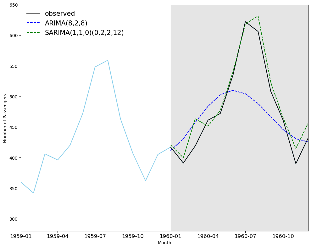
 # ARIMA Vs SARIMA

# Calculate Mean Squared Error (MSE)
mse_arima = mean_squared_error(test, ARIMA_pred)
mse_sarima = mean_squared_error(test, SARIMA_pred)
print(f"ARIMA MSE : {mse_arima}",
      f"SARIMA MSE : {mse_sarima}")

# Calculate Mean Absolute Percentage Error (MAPE)
mape_arima = mean_absolute_percentage_error(test, ARIMA_pred)
mape_sarima = mean_absolute_percentage_error(test, SARIMA_pred)
print(f"ARIMA MAPE: {mape_arima}",
      f"SARIMA MAPE: {mape_sarima}")
ARIMA MSE : 3049.5619315115177 SARIMA MSE : 357.67222439001483
ARIMA MAPE: 0.0822049109636542 SARIMA MAPE: 0.03191015100921741
Quiz#
Q1: To build a daily time series prediction model (approached by ARIMA) for Manhattan yellow taxi pickup patterns. Use 2023-01-01 to 2023-11-30 (11 months) as the training set and 2023-12-01 to 2023-11-30 (1 month) as the testing set. The 2023 yellow taxi can be found in
data/nyc_taxi; the taxi zone geo data (including the lookup of taxi zone in Manhattan borough) can be found indata/taxi_zones. Use thePULocationIDto filter the taxi pickup data in Manhattan borough.Q2: To build a daily time series prediction model (approached by SARIMA) for Manhattan yellow taxi pickup patterns, use the same training and testing set as them in Q1.
Q1 solution
# As taxi data is big data and includes millions of rows, we will only use the January 2023 data for initial exploration.
df_taxi_01 = pd.read_parquet('data/nyc_taxi/yellow_tripdata_2023-01.parquet')
# the columns of the taxi data include: pickup and dropoff datetime, pickup and dropoff location IDs, passenger count, trip distance, fare amount, etc.
df_taxi_01.columns
Index(['VendorID', 'tpep_pickup_datetime', 'tpep_dropoff_datetime',
       'passenger_count', 'trip_distance', 'RatecodeID', 'store_and_fwd_flag',
       'PULocationID', 'DOLocationID', 'payment_type', 'fare_amount', 'extra',
       'mta_tax', 'tip_amount', 'tolls_amount', 'improvement_surcharge',
       'total_amount', 'congestion_surcharge', 'airport_fee'],
      dtype='object')
# millions of rows of taxi trip data
df_taxi_01
| VendorID | tpep_pickup_datetime | tpep_dropoff_datetime | passenger_count | trip_distance | RatecodeID | store_and_fwd_flag | PULocationID | DOLocationID | payment_type | fare_amount | extra | mta_tax | tip_amount | tolls_amount | improvement_surcharge | total_amount | congestion_surcharge | airport_fee | |
|---|---|---|---|---|---|---|---|---|---|---|---|---|---|---|---|---|---|---|---|
| 0 | 2 | 2023-01-01 00:32:10 | 2023-01-01 00:40:36 | 1.0 | 0.97 | 1.0 | N | 161 | 141 | 2 | 9.30 | 1.00 | 0.5 | 0.00 | 0.0 | 1.0 | 14.30 | 2.5 | 0.00 |
| 1 | 2 | 2023-01-01 00:55:08 | 2023-01-01 01:01:27 | 1.0 | 1.10 | 1.0 | N | 43 | 237 | 1 | 7.90 | 1.00 | 0.5 | 4.00 | 0.0 | 1.0 | 16.90 | 2.5 | 0.00 |
| 2 | 2 | 2023-01-01 00:25:04 | 2023-01-01 00:37:49 | 1.0 | 2.51 | 1.0 | N | 48 | 238 | 1 | 14.90 | 1.00 | 0.5 | 15.00 | 0.0 | 1.0 | 34.90 | 2.5 | 0.00 |
| 3 | 1 | 2023-01-01 00:03:48 | 2023-01-01 00:13:25 | 0.0 | 1.90 | 1.0 | N | 138 | 7 | 1 | 12.10 | 7.25 | 0.5 | 0.00 | 0.0 | 1.0 | 20.85 | 0.0 | 1.25 |
| 4 | 2 | 2023-01-01 00:10:29 | 2023-01-01 00:21:19 | 1.0 | 1.43 | 1.0 | N | 107 | 79 | 1 | 11.40 | 1.00 | 0.5 | 3.28 | 0.0 | 1.0 | 19.68 | 2.5 | 0.00 |
| ... | ... | ... | ... | ... | ... | ... | ... | ... | ... | ... | ... | ... | ... | ... | ... | ... | ... | ... | ... |
| 3066761 | 2 | 2023-01-31 23:58:34 | 2023-02-01 00:12:33 | NaN | 3.05 | NaN | None | 107 | 48 | 0 | 15.80 | 0.00 | 0.5 | 3.96 | 0.0 | 1.0 | 23.76 | NaN | NaN |
| 3066762 | 2 | 2023-01-31 23:31:09 | 2023-01-31 23:50:36 | NaN | 5.80 | NaN | None | 112 | 75 | 0 | 22.43 | 0.00 | 0.5 | 2.64 | 0.0 | 1.0 | 29.07 | NaN | NaN |
| 3066763 | 2 | 2023-01-31 23:01:05 | 2023-01-31 23:25:36 | NaN | 4.67 | NaN | None | 114 | 239 | 0 | 17.61 | 0.00 | 0.5 | 5.32 | 0.0 | 1.0 | 26.93 | NaN | NaN |
| 3066764 | 2 | 2023-01-31 23:40:00 | 2023-01-31 23:53:00 | NaN | 3.15 | NaN | None | 230 | 79 | 0 | 18.15 | 0.00 | 0.5 | 4.43 | 0.0 | 1.0 | 26.58 | NaN | NaN |
| 3066765 | 2 | 2023-01-31 23:07:32 | 2023-01-31 23:21:56 | NaN | 2.85 | NaN | None | 262 | 143 | 0 | 15.97 | 0.00 | 0.5 | 2.00 | 0.0 | 1.0 | 21.97 | NaN | NaN |
3066766 rows × 19 columns
import glob
data_files = glob.glob('data/nyc_taxi/**.parquet', recursive=True)
print(data_files)
['data/nyc_taxi/yellow_tripdata_2023-06.parquet', 'data/nyc_taxi/yellow_tripdata_2023-07.parquet', 'data/nyc_taxi/yellow_tripdata_2023-05.parquet', 'data/nyc_taxi/yellow_tripdata_2023-04.parquet', 'data/nyc_taxi/yellow_tripdata_2023-08.parquet', 'data/nyc_taxi/yellow_tripdata_2023-11.parquet', 'data/nyc_taxi/yellow_tripdata_2023-01.parquet', 'data/nyc_taxi/yellow_tripdata_2023-10.parquet', 'data/nyc_taxi/yellow_tripdata_2023-09.parquet', 'data/nyc_taxi/yellow_tripdata_2023-12.parquet', 'data/nyc_taxi/yellow_tripdata_2023-02.parquet', 'data/nyc_taxi/yellow_tripdata_2023-03.parquet']
# read all the taxi data files in 2023 and concat as one df
df_taxi_2023 = pd.concat([pd.read_parquet(file) for file in data_files], ignore_index=True)
print(df_taxi_2023.shape)
(38310226, 20)
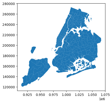
import geopandas as gpd
gdf_taxi_zone = gpd.read_file('data/taxi_zones/taxi_zones.shp')
gdf_taxi_zone.plot()
<Axes: >
# select the manhattan taxi zone ids
man_zone_id = gdf_taxi_zone[gdf_taxi_zone.borough == 'Manhattan'].LocationID.to_list()
# manhattan taxi zones
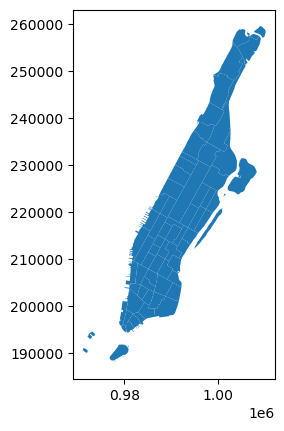
gdf_taxi_zone[gdf_taxi_zone.borough == 'Manhattan'].plot()
<Axes: >
# select the taxi pickup trips in manhattan, we don't create the new df variable here for saving memory
df_taxi_2023 = df_taxi_2023[df_taxi_2023.PULocationID.isin(man_zone_id)]
# we need to drop off the pickup date time is not in 2023
df_taxi_2023 = df_taxi_2023[df_taxi_2023.tpep_pickup_datetime.dt.year == 2023]
df_taxi_2023
| VendorID | tpep_pickup_datetime | tpep_dropoff_datetime | passenger_count | trip_distance | RatecodeID | store_and_fwd_flag | PULocationID | DOLocationID | payment_type | fare_amount | extra | mta_tax | tip_amount | tolls_amount | improvement_surcharge | total_amount | congestion_surcharge | Airport_fee | airport_fee | |
|---|---|---|---|---|---|---|---|---|---|---|---|---|---|---|---|---|---|---|---|---|
| 0 | 1 | 2023-06-01 00:08:48 | 2023-06-01 00:29:41 | 1.0 | 3.40 | 1.0 | N | 140 | 238 | 1 | 21.90 | 3.5 | 0.5 | 6.70 | 0.0 | 1.0 | 33.60 | 2.5 | 0.0 | NaN |
| 1 | 1 | 2023-06-01 00:15:04 | 2023-06-01 00:25:18 | 0.0 | 3.40 | 1.0 | N | 50 | 151 | 1 | 15.60 | 3.5 | 0.5 | 3.00 | 0.0 | 1.0 | 23.60 | 2.5 | 0.0 | NaN |
| 3 | 2 | 2023-06-01 00:54:03 | 2023-06-01 01:17:29 | 3.0 | 9.83 | 1.0 | N | 100 | 244 | 1 | 39.40 | 1.0 | 0.5 | 8.88 | 0.0 | 1.0 | 53.28 | 2.5 | 0.0 | NaN |
| 4 | 2 | 2023-06-01 00:18:44 | 2023-06-01 00:27:18 | 1.0 | 1.17 | 1.0 | N | 137 | 234 | 1 | 9.30 | 1.0 | 0.5 | 0.72 | 0.0 | 1.0 | 15.02 | 2.5 | 0.0 | NaN |
| 5 | 1 | 2023-06-01 00:32:36 | 2023-06-01 00:45:52 | 2.0 | 3.60 | 1.0 | N | 249 | 33 | 1 | 18.40 | 3.5 | 0.5 | 4.65 | 0.0 | 1.0 | 28.05 | 2.5 | 0.0 | NaN |
| ... | ... | ... | ... | ... | ... | ... | ... | ... | ... | ... | ... | ... | ... | ... | ... | ... | ... | ... | ... | ... |
| 38310221 | 2 | 2023-03-31 23:24:25 | 2023-03-31 23:40:54 | NaN | 3.16 | NaN | None | 163 | 75 | 0 | 12.13 | 0.0 | 0.5 | 4.23 | 0.0 | 1.0 | 20.36 | NaN | NaN | NaN |
| 38310222 | 2 | 2023-03-31 23:24:50 | 2023-04-01 00:04:12 | NaN | 6.89 | NaN | None | 125 | 198 | 0 | 40.92 | 0.0 | 0.5 | 8.98 | 0.0 | 1.0 | 53.90 | NaN | NaN | NaN |
| 38310223 | 2 | 2023-03-31 23:26:31 | 2023-03-31 23:49:39 | NaN | 4.01 | NaN | None | 50 | 224 | 0 | 24.02 | 0.0 | 0.5 | 0.00 | 0.0 | 1.0 | 28.02 | NaN | NaN | NaN |
| 38310224 | 2 | 2023-03-31 23:07:51 | 2023-03-31 23:15:56 | NaN | 1.31 | NaN | None | 113 | 158 | 0 | 8.51 | 0.0 | 0.5 | 3.50 | 0.0 | 1.0 | 16.01 | NaN | NaN | NaN |
| 38310225 | 2 | 2023-03-31 23:26:12 | 2023-03-31 23:31:47 | NaN | 0.88 | NaN | None | 41 | 166 | 0 | 13.51 | 0.0 | 0.5 | 2.25 | 0.0 | 1.0 | 17.26 | NaN | NaN | NaN |
33806154 rows × 20 columns
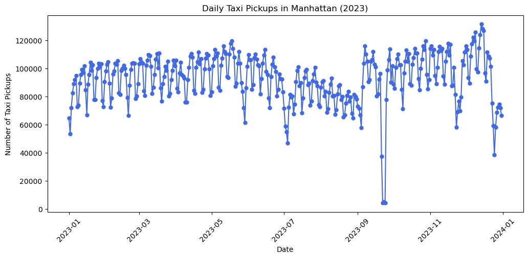
# we aggregate the taxi pickup trips by day, i.e., the daily number of taxi pickups numbers
df_taxi_daily = df_taxi_2023.groupby(df_taxi_2023.tpep_pickup_datetime.dt.date).size().reset_index(name='pickup_count')
df_taxi_daily
| tpep_pickup_datetime | pickup_count | |
|---|---|---|
| 0 | 2023-01-01 | 64511 |
| 1 | 2023-01-02 | 53233 |
| 2 | 2023-01-03 | 71924 |
| 3 | 2023-01-04 | 82533 |
| 4 | 2023-01-05 | 89035 |
| ... | ... | ... |
| 360 | 2023-12-27 | 68743 |
| 361 | 2023-12-28 | 72478 |
| 362 | 2023-12-29 | 74490 |
| 363 | 2023-12-30 | 71850 |
| 364 | 2023-12-31 | 66346 |
365 rows × 2 columns
# we plot the df_taxi_daily to see the daily taxi pickup patterns
import matplotlib.pyplot as plt
plt.figure(figsize=(12, 5))
plt.plot(df_taxi_daily.tpep_pickup_datetime, df_taxi_daily.pickup_count, marker='o', markersize=5, linestyle='-', color='royalblue')
plt.xlabel('Date')
plt.ylabel('Number of Taxi Pickups')
plt.title('Daily Taxi Pickups in Manhattan (2023)')
plt.xticks(rotation=45)
plt.show()
# we select the training set and testing set from the first 11 months and the last month
from datetime import date
train_data = df_taxi_daily[df_taxi_daily.tpep_pickup_datetime  < date(2023, 12, 1)].pickup_count.to_list()
test_data = df_taxi_daily[df_taxi_daily.tpep_pickup_datetime >= date(2023, 12, 1)].pickup_count.to_list()
print(len(train_data), len(test_data))
334 31
from itertools import product
ps = range(0, 8, 1) # set p range
qs = range(0, 8, 1) # set q range
d = 2 # set d (this can be range as well)
order_list = list(product(ps, qs))
print(order_list)
[(0, 0), (0, 1), (0, 2), (0, 3), (0, 4), (0, 5), (0, 6), (0, 7), (1, 0), (1, 1), (1, 2), (1, 3), (1, 4), (1, 5), (1, 6), (1, 7), (2, 0), (2, 1), (2, 2), (2, 3), (2, 4), (2, 5), (2, 6), (2, 7), (3, 0), (3, 1), (3, 2), (3, 3), (3, 4), (3, 5), (3, 6), (3, 7), (4, 0), (4, 1), (4, 2), (4, 3), (4, 4), (4, 5), (4, 6), (4, 7), (5, 0), (5, 1), (5, 2), (5, 3), (5, 4), (5, 5), (5, 6), (5, 7), (6, 0), (6, 1), (6, 2), (6, 3), (6, 4), (6, 5), (6, 6), (6, 7), (7, 0), (7, 1), (7, 2), (7, 3), (7, 4), (7, 5), (7, 6), (7, 7)]
%%time
import warnings
warnings.filterwarnings('ignore')
# arima model training
result_df = optimize_arima(train_data, order_list, d)
CPU times: user 21.7 s, sys: 1min 30s, total: 1min 52s
Wall time: 11.2 s
result_df
| (p,q) | AIC | |
|---|---|---|
| 0 | (6, 7) | 7028.966814 |
| 1 | (7, 7) | 7029.699817 |
| 2 | (6, 5) | 7052.473651 |
| 3 | (6, 4) | 7052.630955 |
| 4 | (7, 4) | 7052.875876 |
| ... | ... | ... |
| 59 | (4, 0) | 7303.356550 |
| 60 | (3, 0) | 7329.926192 |
| 61 | (2, 0) | 7337.828697 |
| 62 | (1, 0) | 7354.291165 |
| 63 | (0, 0) | 7392.991585 |
64 rows × 2 columns
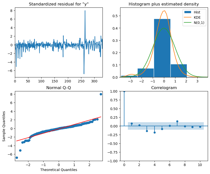
model = SARIMAX(train_data, order=(6,2,7)) # Selecting the best p,d,q for ARIMA
model_fit = model.fit(disp=False)
# plot_diagnostics
model_fit.plot_diagnostics(figsize=(10,8))
plt.show()
# In our case, we use the previous 11-month daily data to train the model and predict the last 31 days.
ARIMA_pred = model_fit.forecast(steps=31)
# Plotting the prediction
plt.figure(figsize=(10, 5))
plt.plot(df_taxi_daily.tpep_pickup_datetime[-31:].values, test_data, color='royalblue', lw=1.5, marker='o',markersize=4,label='Actual Data')
plt.plot(df_taxi_daily.tpep_pickup_datetime[-31:].values, ARIMA_pred, color='orange',lw=1, marker='o', markersize=5, label='Prediction Data')
# Adding labels and title
plt.xlabel('Date')
plt.ylabel('Number of Taxi Pickups')
plt.title('Time series forecasting using ARIMA')
plt.legend(frameon=False)
plt.xticks(fontsize=6, rotation=90)  # Adjust font size and rotation angle
plt.show()

Q2 solution
# Set the ranges of parameters
from itertools import product
ps = range(1, 3, 1)
ds = range(1, 3, 1)
qs = range(1, 3, 1)

Ps = range(1, 3, 1)
Ds = range(1, 3, 1)
Qs = range(1, 3, 1)
m = 7

SARIMA_order_list = list(product(ps,ds,qs,Ps,Ds,Qs))
print(len(SARIMA_order_list), 'sets of parameters')
64 sets of parameters
%%time
import warnings
warnings.filterwarnings('ignore')

SARIMA_result_df = optimize_sarima(train_data, SARIMA_order_list, m)
Error encountered for order (1, 1, 1, 2, 2, 2): LU decomposition error.
CPU times: user 2min 5s, sys: 12min 23s, total: 14min 28s
Wall time: 1min 4s
SARIMA_result_df
| (p,d,q) | (P,D,Q) | AIC | |
|---|---|---|---|
| 0 | (1, 2, 1) | (1, 2, 2) | 6751.944178 |
| 1 | (1, 1, 1) | (1, 2, 2) | 6755.252049 |
| 2 | (2, 1, 1) | (1, 2, 2) | 6762.305981 |
| 3 | (1, 2, 1) | (1, 2, 1) | 6800.660733 |
| 4 | (2, 2, 1) | (1, 2, 1) | 6802.222850 |
| ... | ... | ... | ... |
| 58 | (1, 2, 2) | (2, 2, 2) | 7019.539355 |
| 59 | (1, 2, 2) | (2, 2, 1) | 7021.531657 |
| 60 | (1, 2, 2) | (1, 2, 1) | 7023.909069 |
| 61 | (1, 2, 1) | (2, 2, 2) | 7026.411081 |
| 62 | (1, 2, 1) | (2, 2, 1) | 7027.834838 |
63 rows × 3 columns
# Selecting the optimised parameters for SARIMA
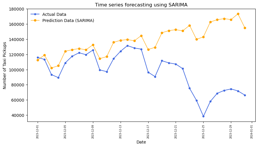
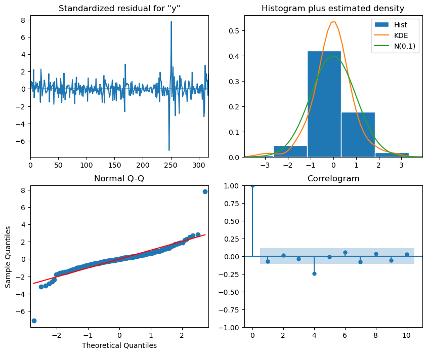
SARIMA_model = SARIMAX(train_data, order=(1,2,1), seasonal_order=(1,2,2,7), simple_differencing=False)
SARIMA_model_fit = SARIMA_model.fit(disp=False)
# The residual analysis for optimised SARIMA, see the interpretation listed in the last section.
SARIMA_model_fit.plot_diagnostics(figsize=(10,8))
plt.show()
# plot the prediction
SARIMA_pred = SARIMA_model_fit.forecast(steps=31)
plt.figure(figsize=(10, 5))
plt.plot(df_taxi_daily.tpep_pickup_datetime[-31:].values, test_data, color='royalblue', lw=1.5, marker='o',markersize=4,label='Actual Data')
plt.plot(df_taxi_daily.tpep_pickup_datetime[-31:].values, SARIMA_pred, color='orange',lw=1, marker='o', markersize=5, label='Prediction Data (SARIMA)')
# Adding labels and title
plt.xlabel('Date')
plt.ylabel('Number of Taxi Pickups')
plt.title('Time series forecasting using SARIMA')
plt.legend(frameon=False)
plt.xticks(fontsize=6, rotation=90)  # Adjust font size and rotation angle
plt.show()